about the brand:
LU - лучшие [luchshiye] - best
MO - моменты [momenty] - moments
MO - моменты [momenty] - moments
LU MO has been creating large-scale and memorable events for over 5 years. This is a full-cycle event agency that turns ideas into reality, from concept development to execution. It also solves clients' business challenges by organizing forums, conferences, and corporate events.
The LU MO team selects the perfect venues, develops scripts, coordinates artists and technical teams, and creates an atmosphere with a beautiful, intelligent, and creative approach. With LU MO, your events become memories that last.
Here's three visual identity concepts I've created for this brand:
CONCEPT NO1
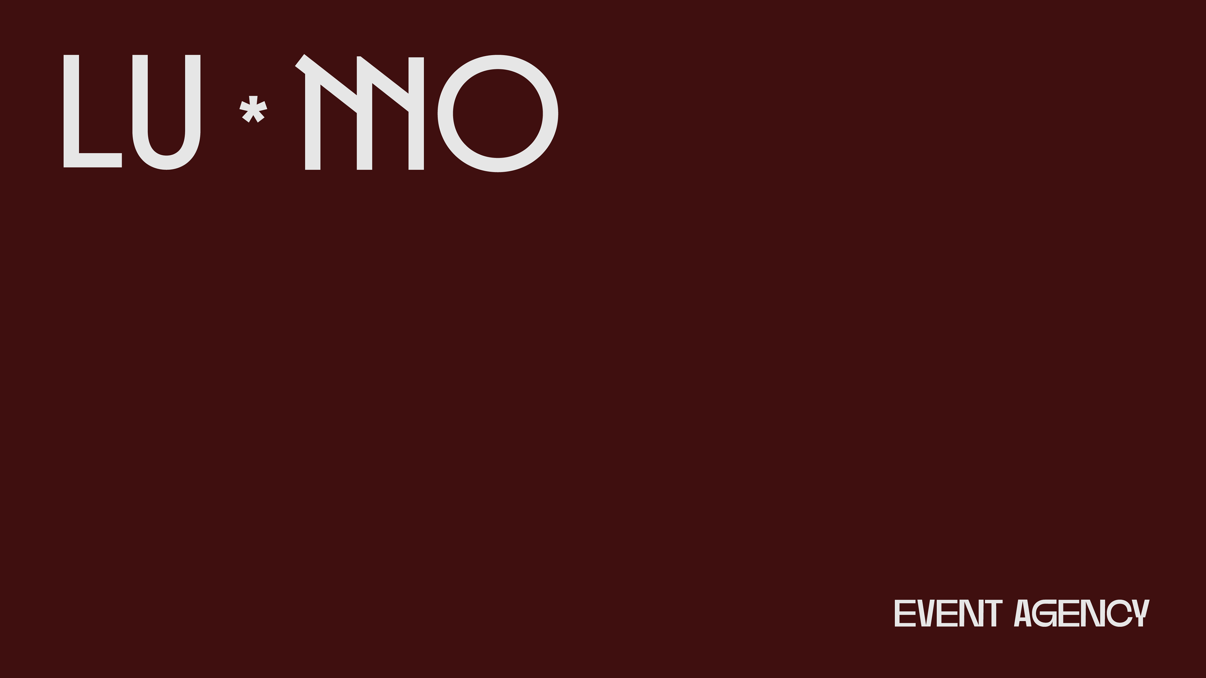
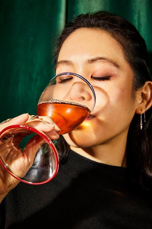
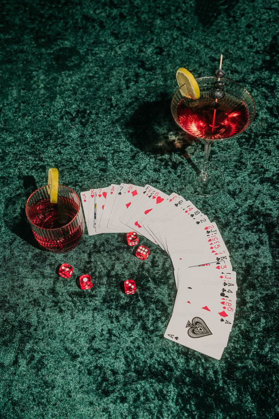
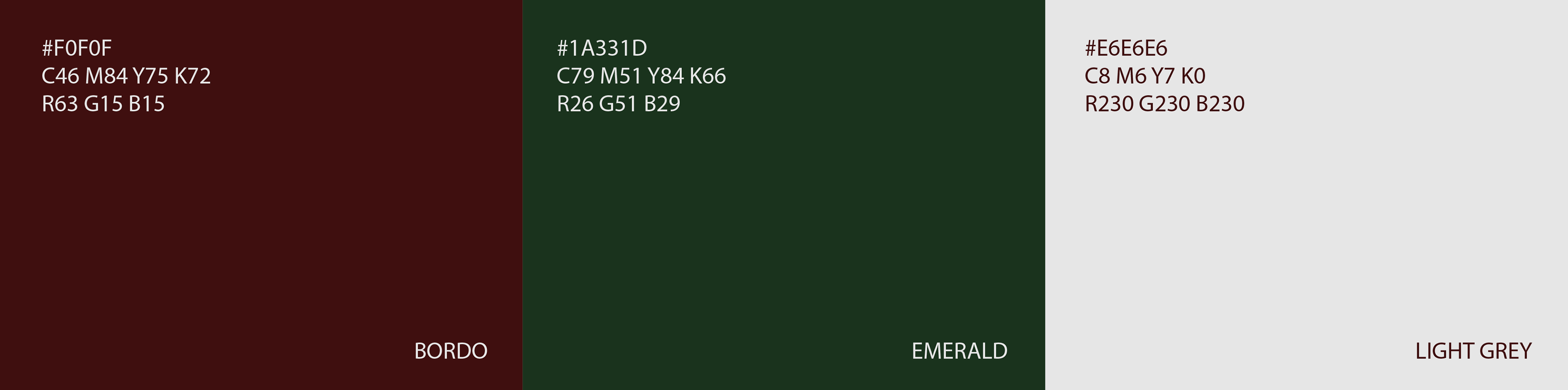
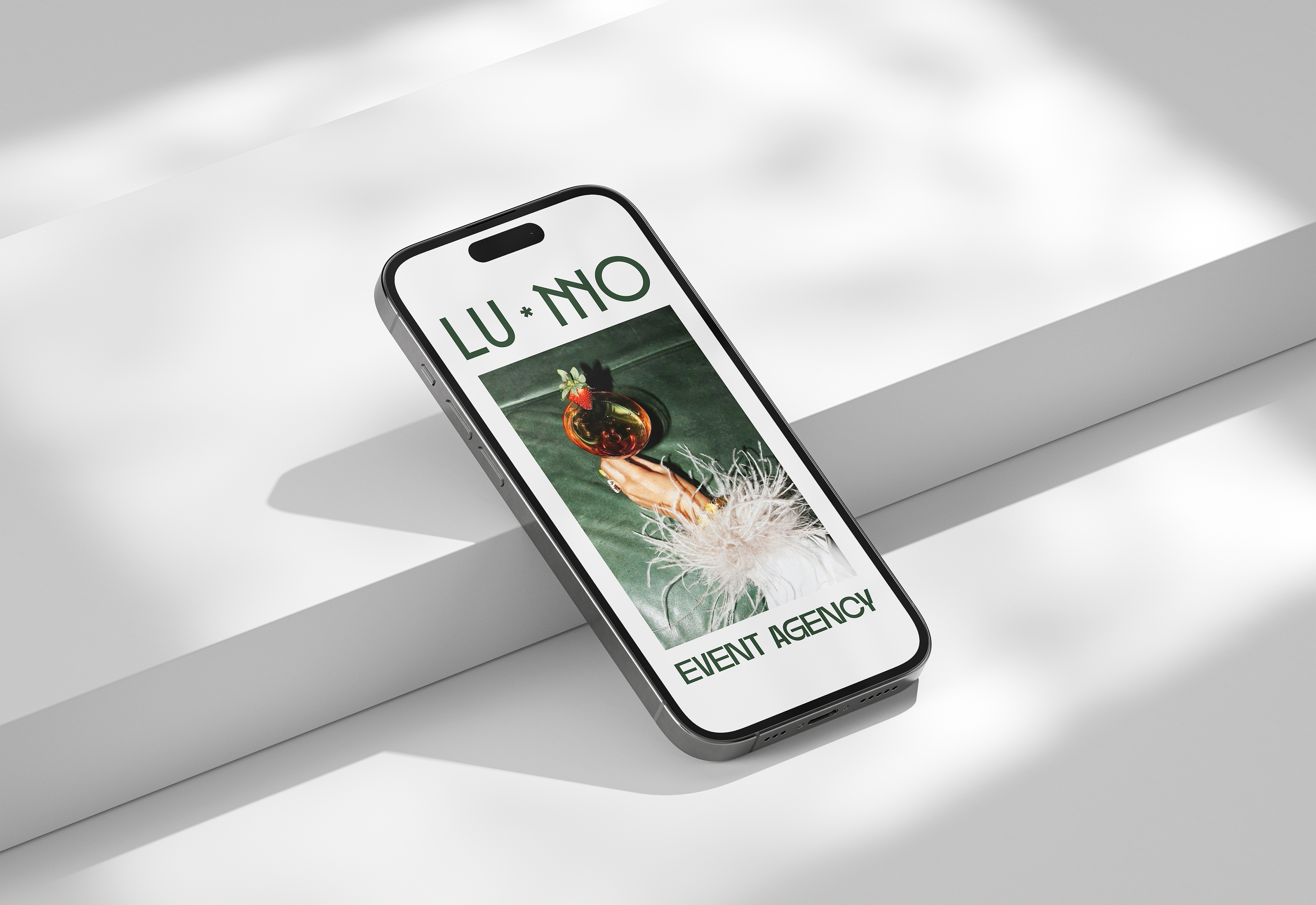
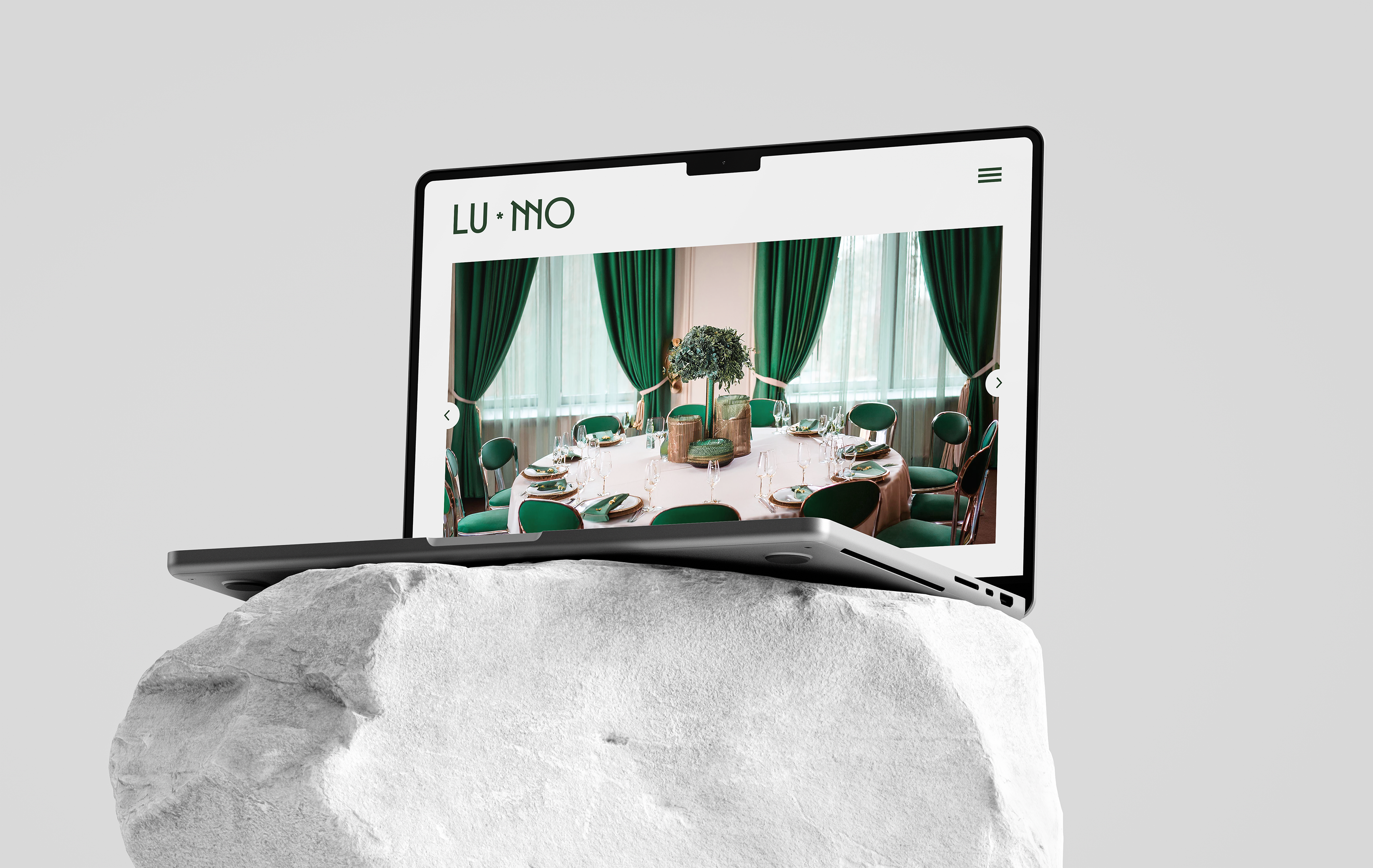
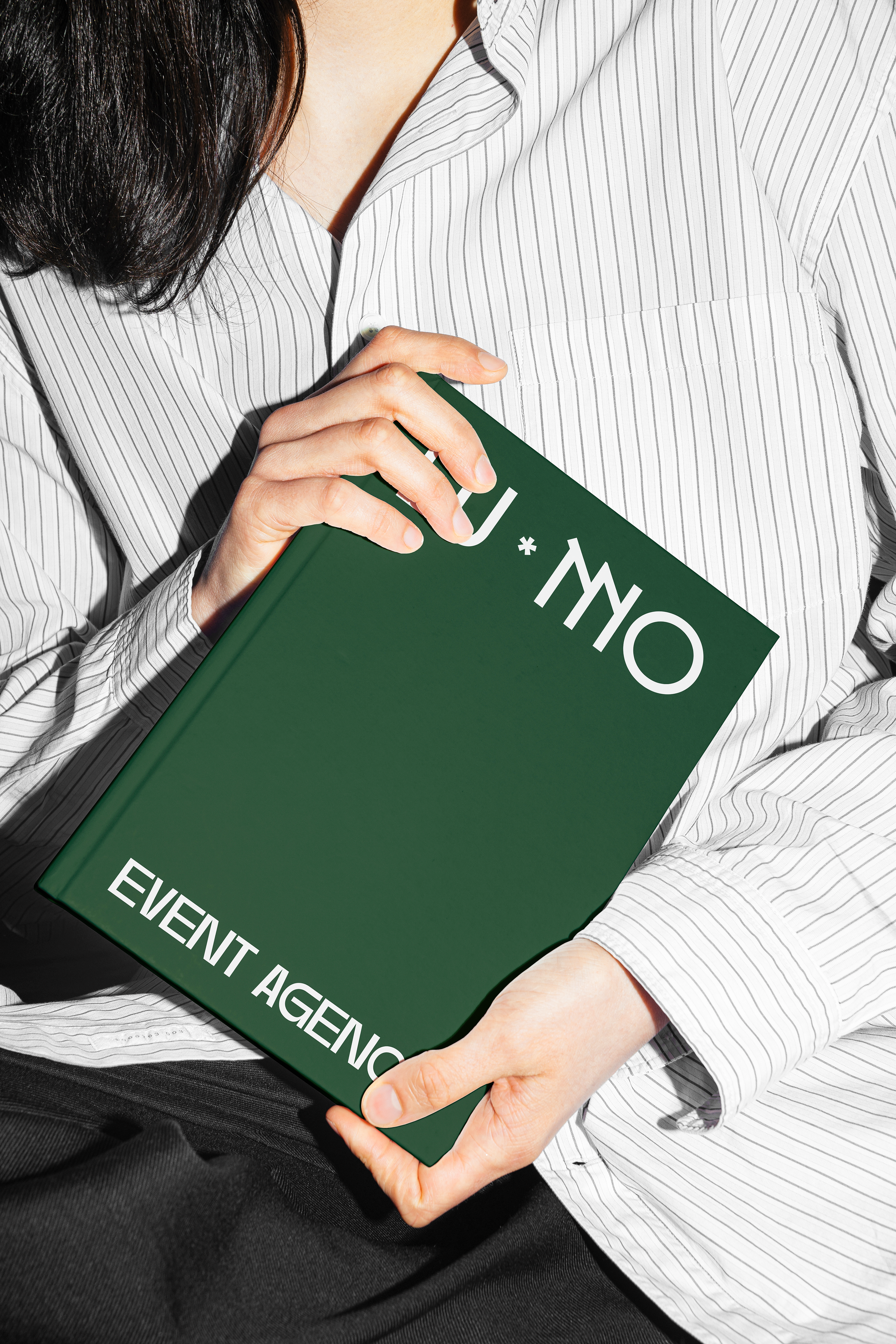
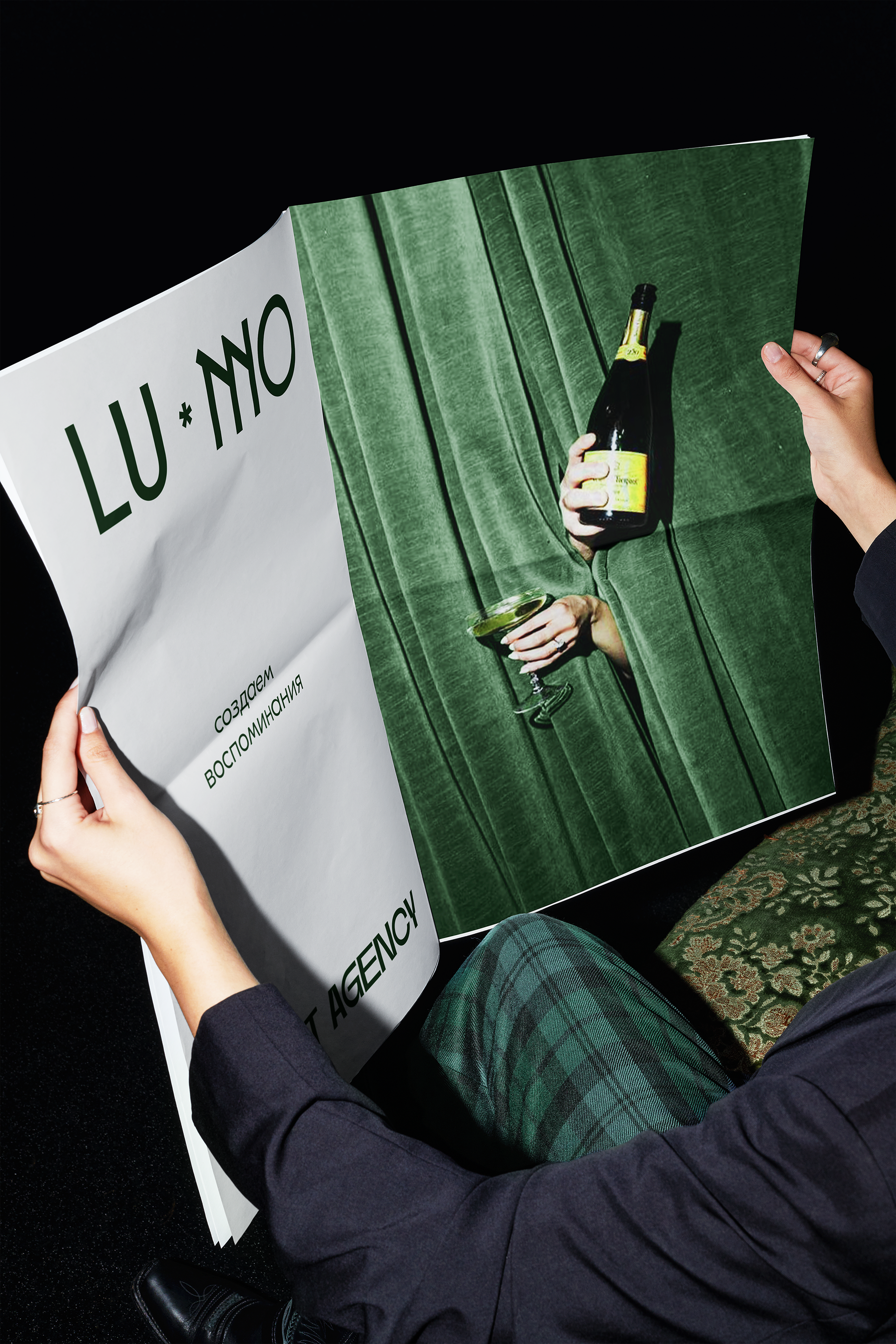
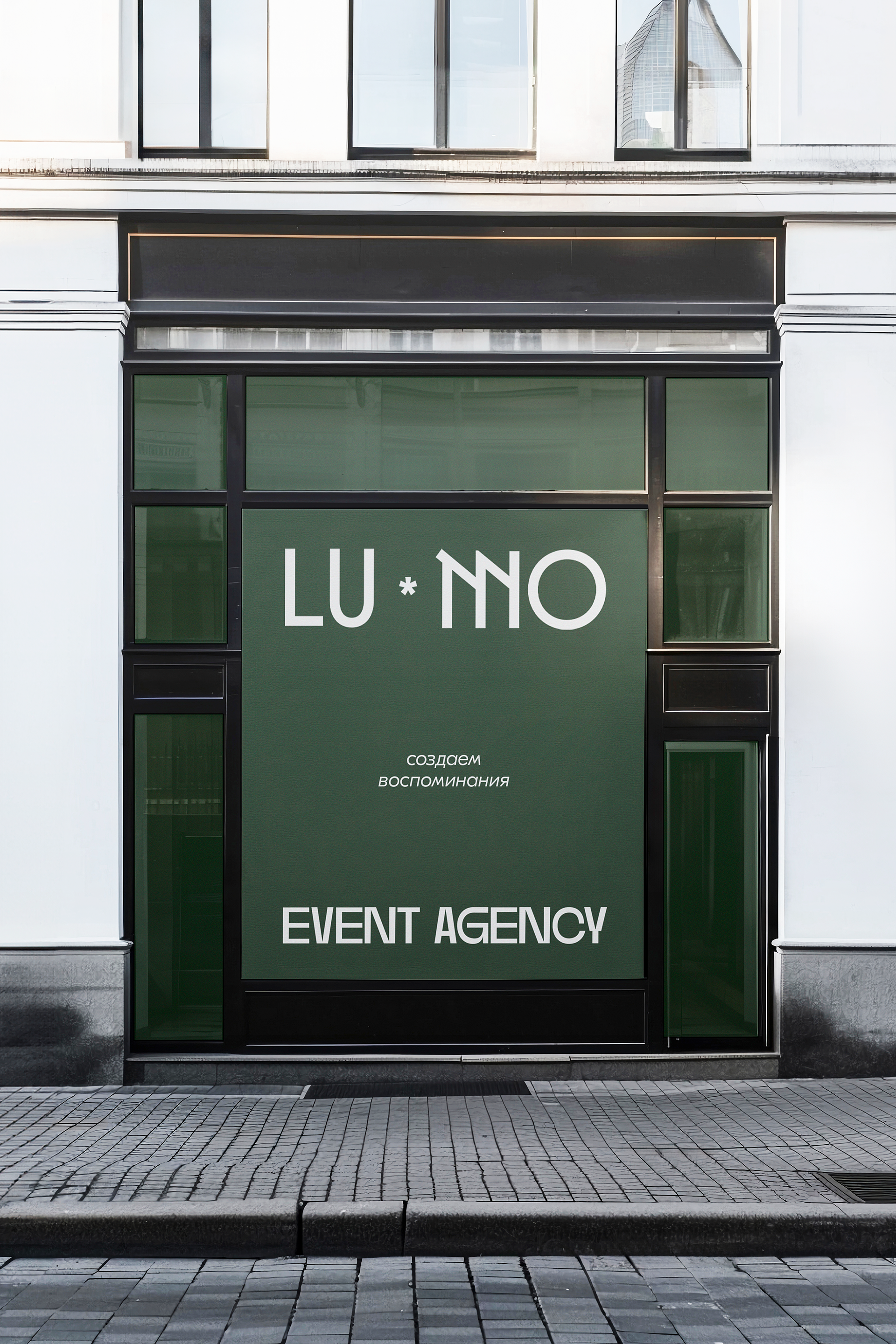
The first branding concept for this company is based on the client’s brief, where it was mentioned that a combination of emerald and burgundy shades would suit the brand. I agree that these colors are perfect for this field and reflect the brand's elegance, maturity, and sophistication. So I aimed to play around with this color combination and create a minimalist and modern identity.

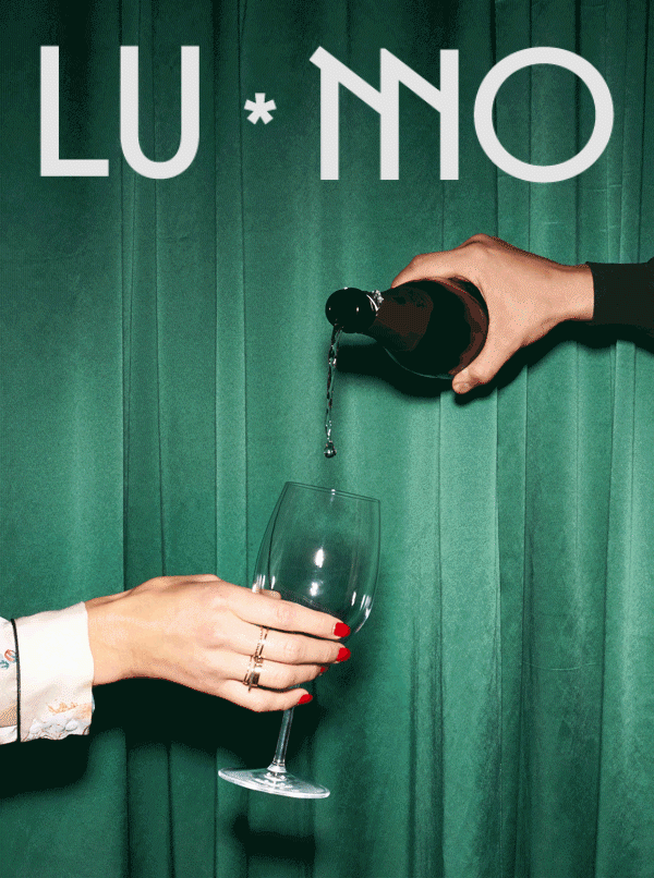
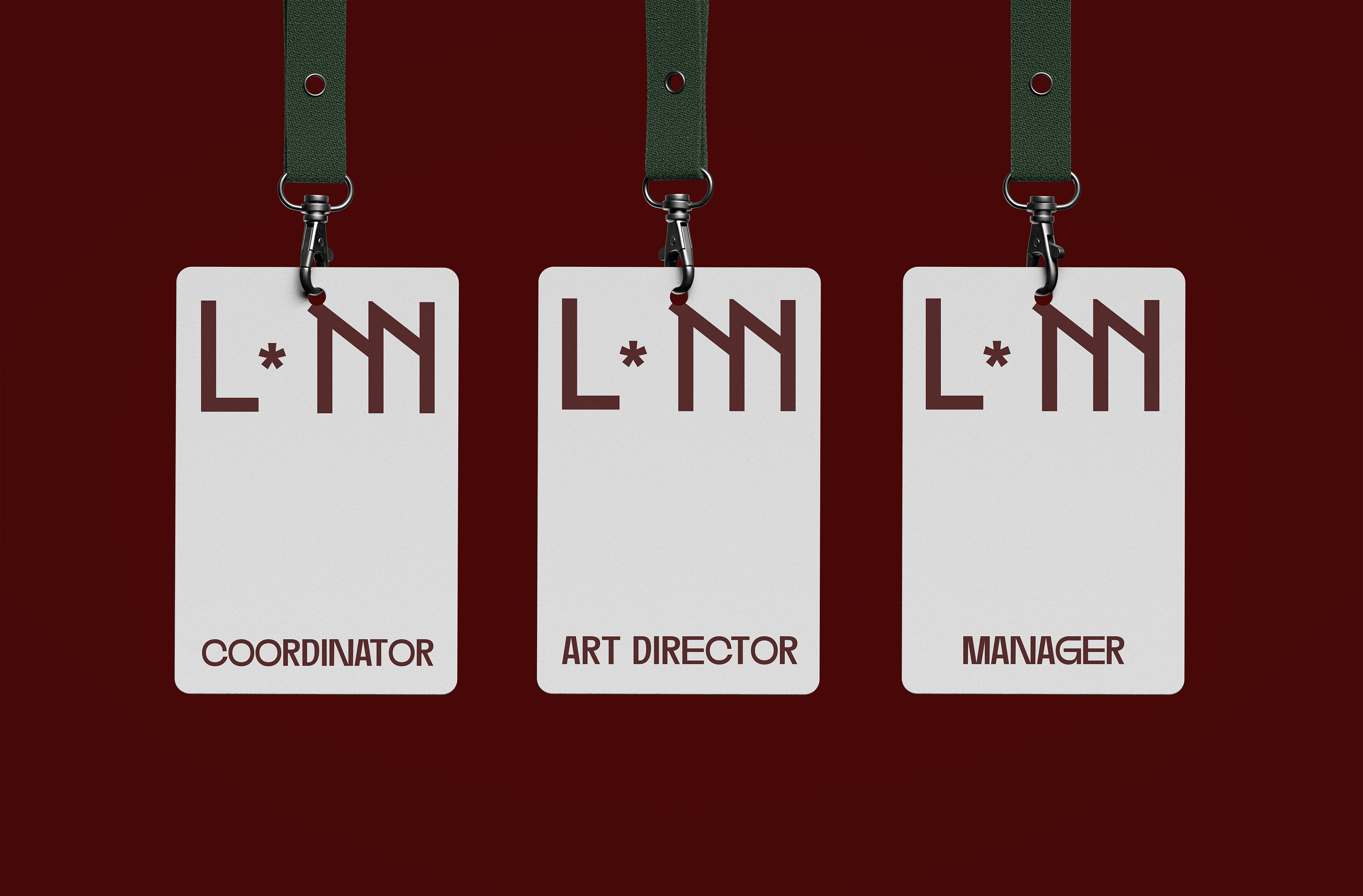
PRIMARY LOGO
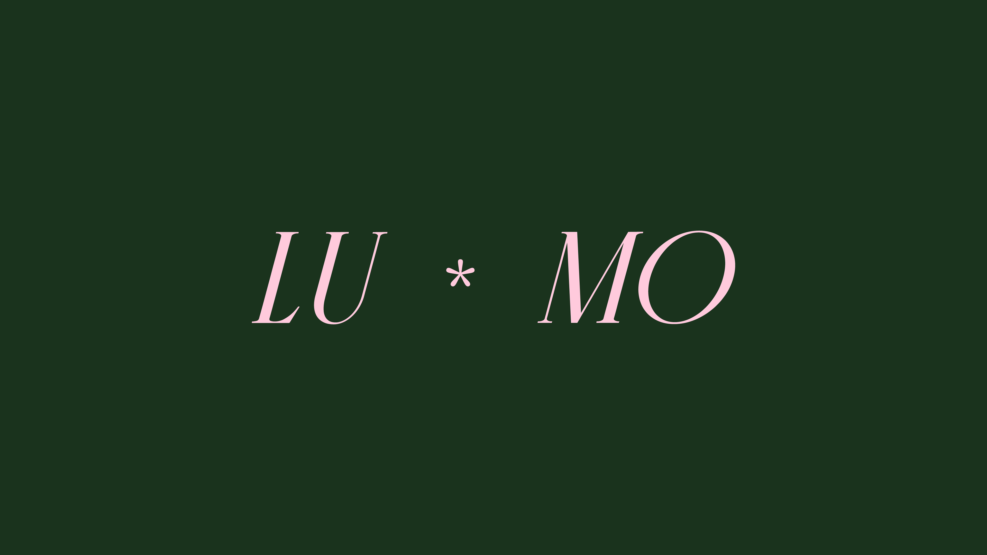
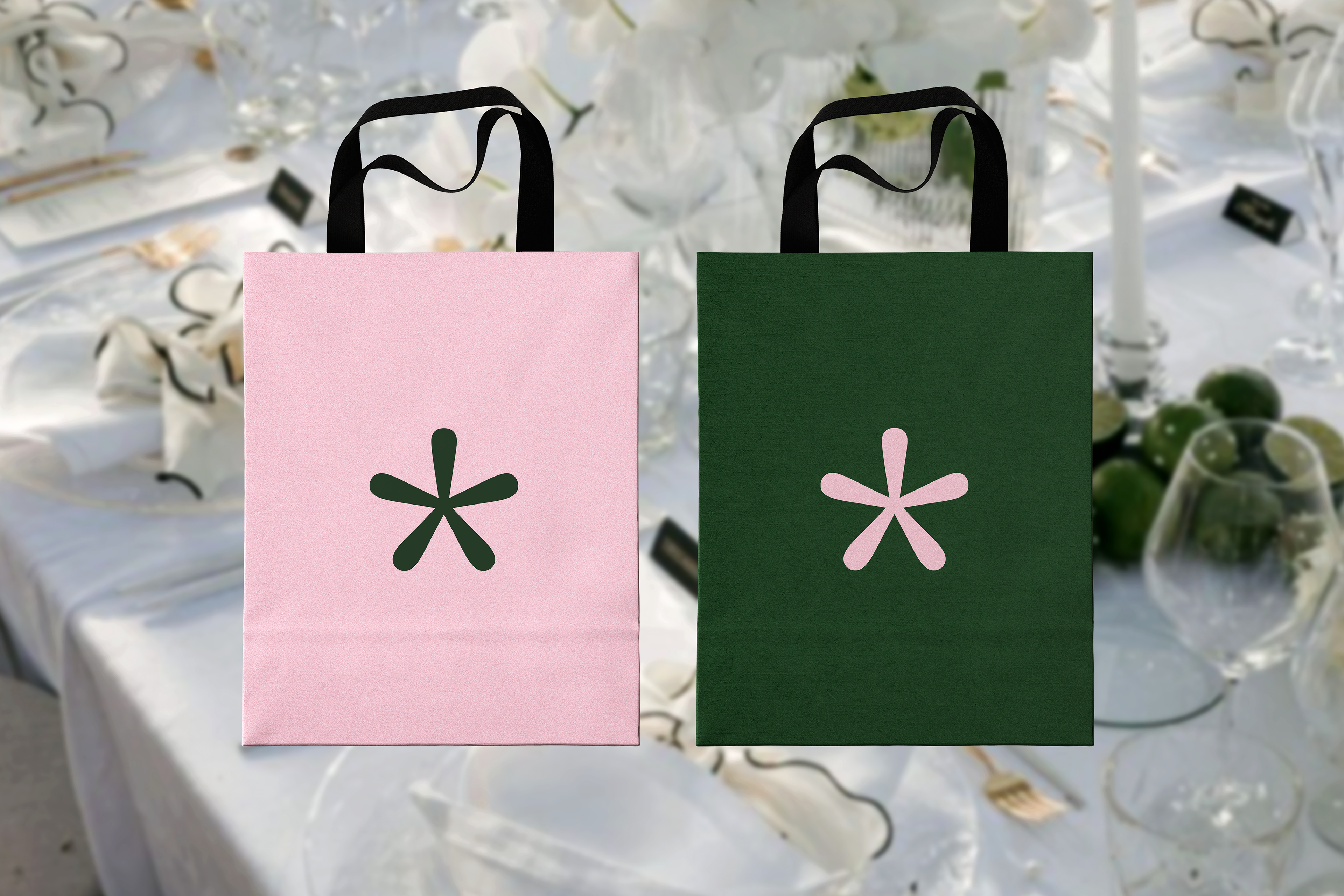
For the logo, I decided to use a font that reflects the brand’s modernity and its desire to stand out from the crowd, while still being concise and elegant. In this logo concept, I chose not to place the first and second parts of the logo on separate lines. Instead, I used an asterisk symbol, which helps both to divide and unify them into a cohesive logo.
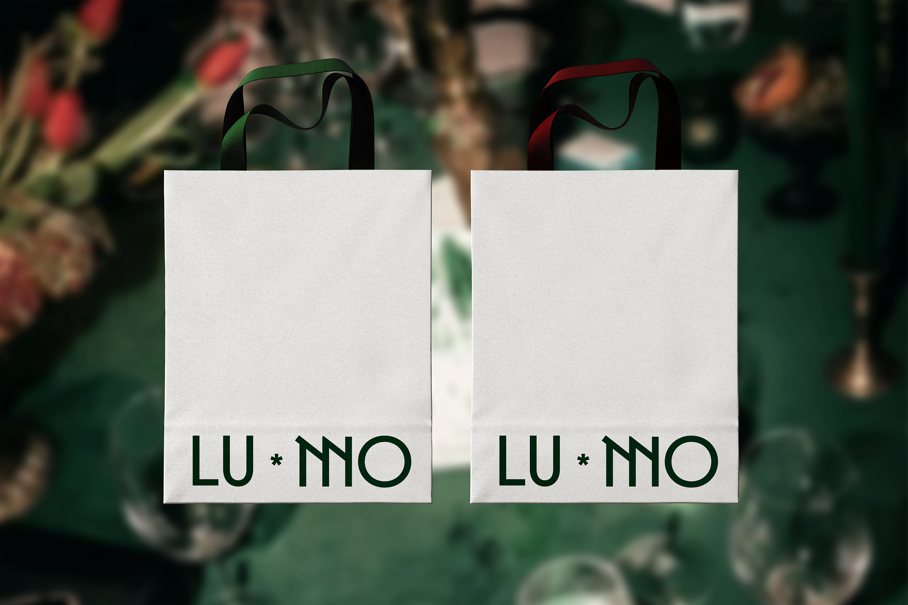
SUBMARK

COLOR PALETTE
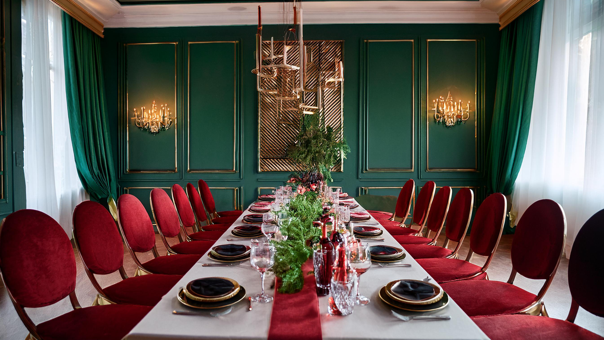
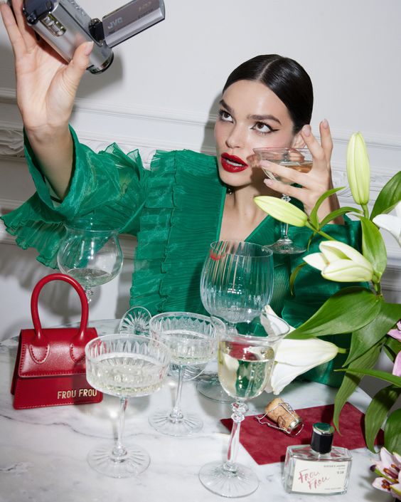
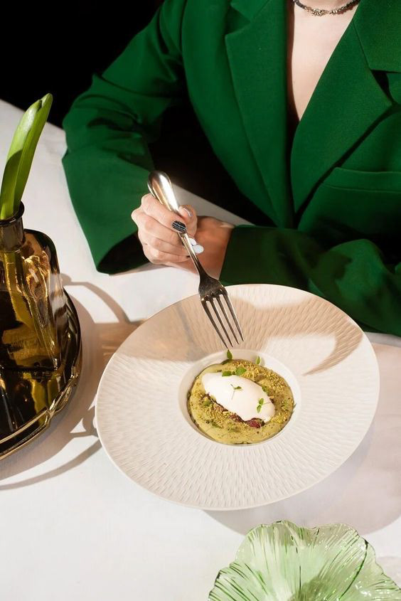
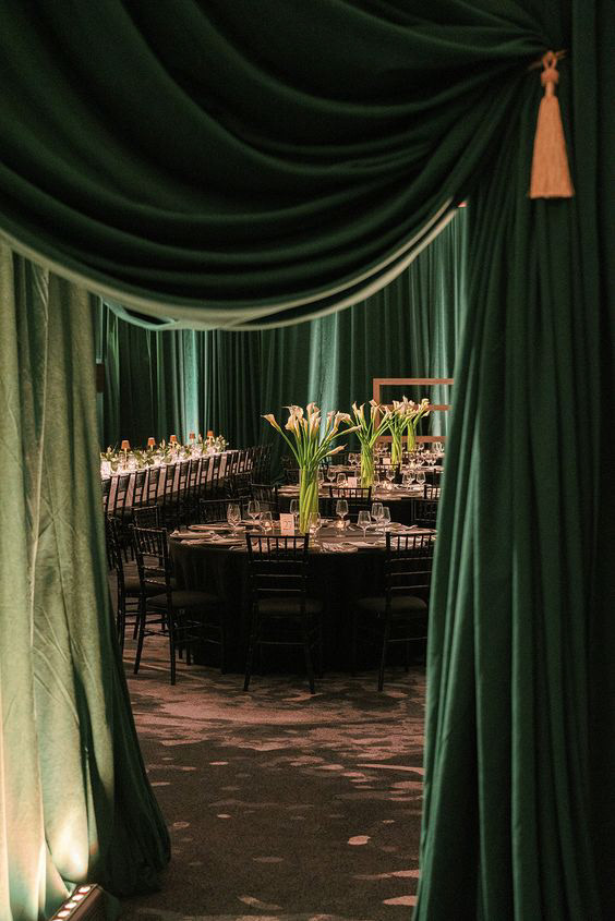
IDENTITY IN ACTION
CONCEPT NO2
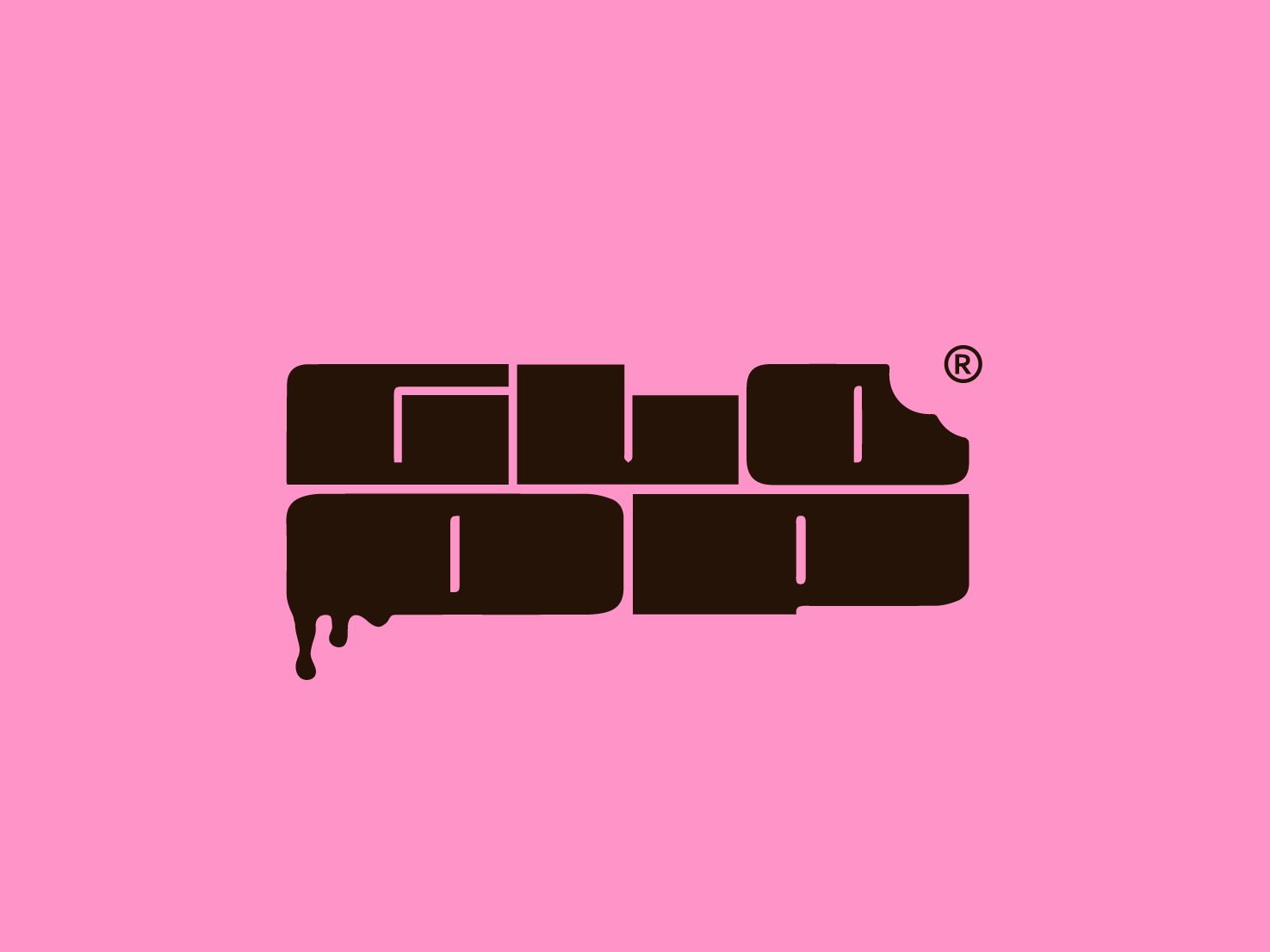
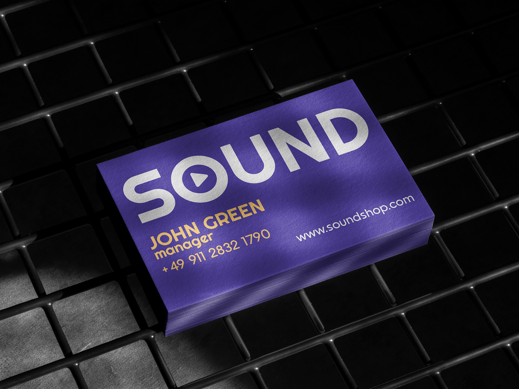
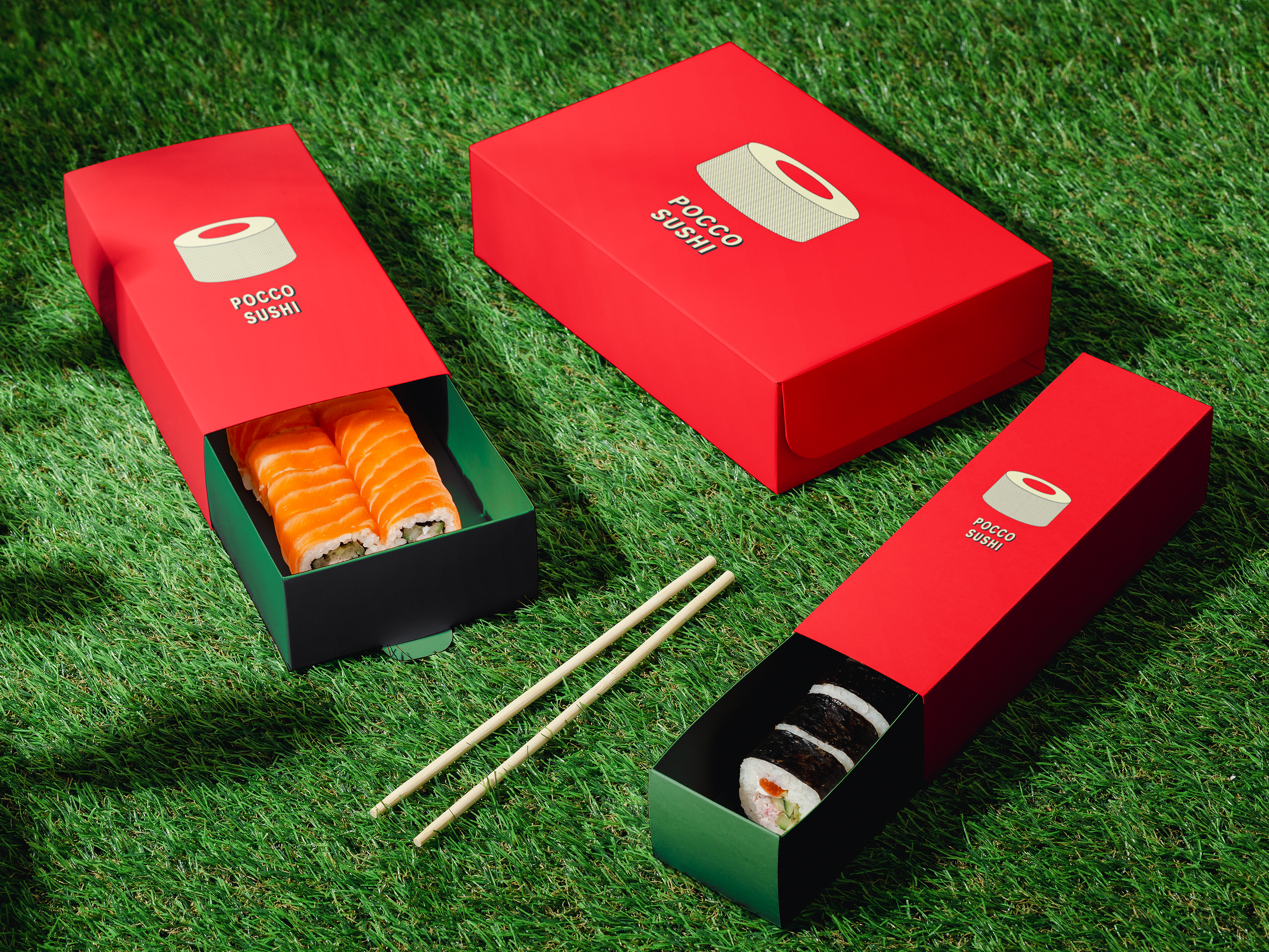
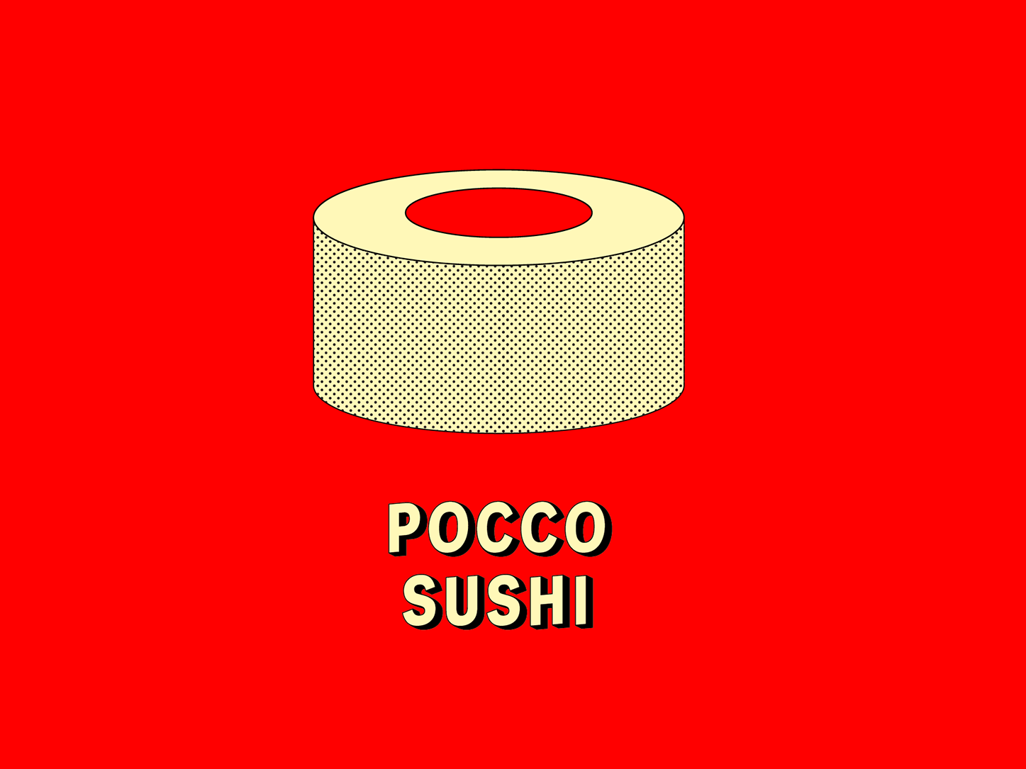
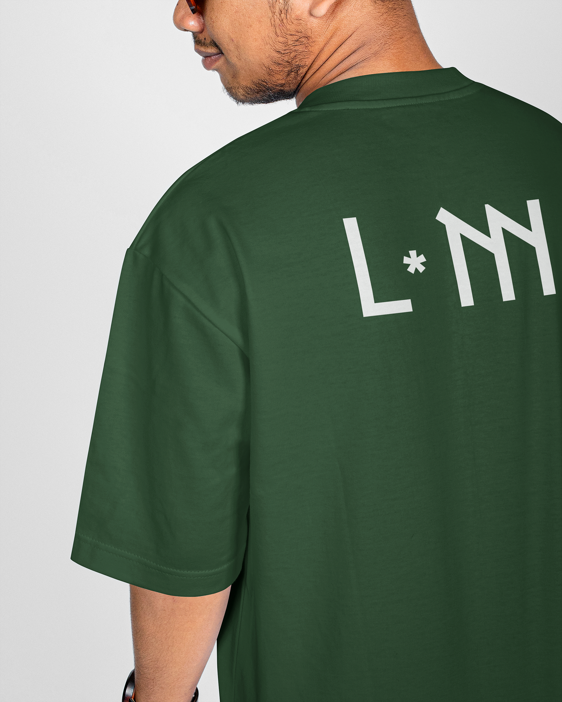
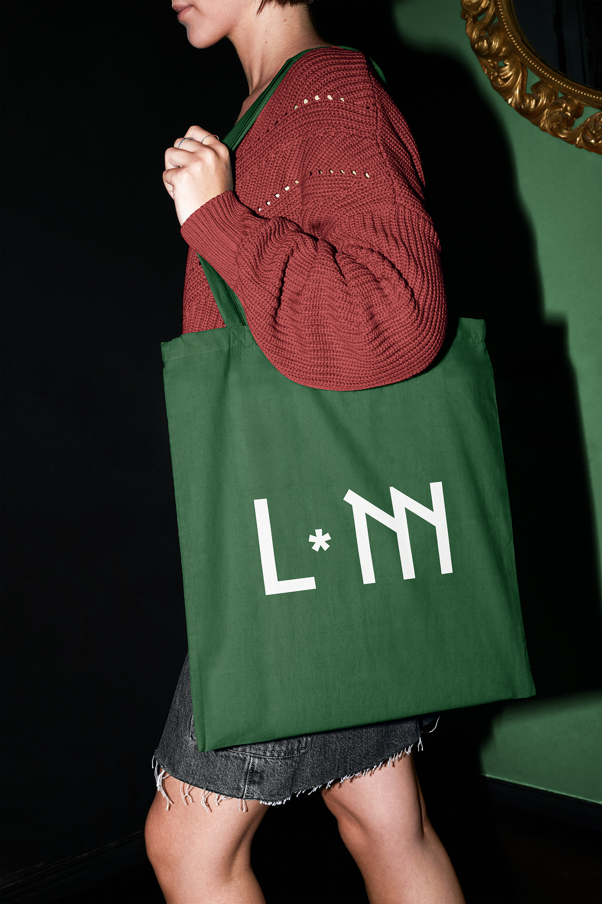
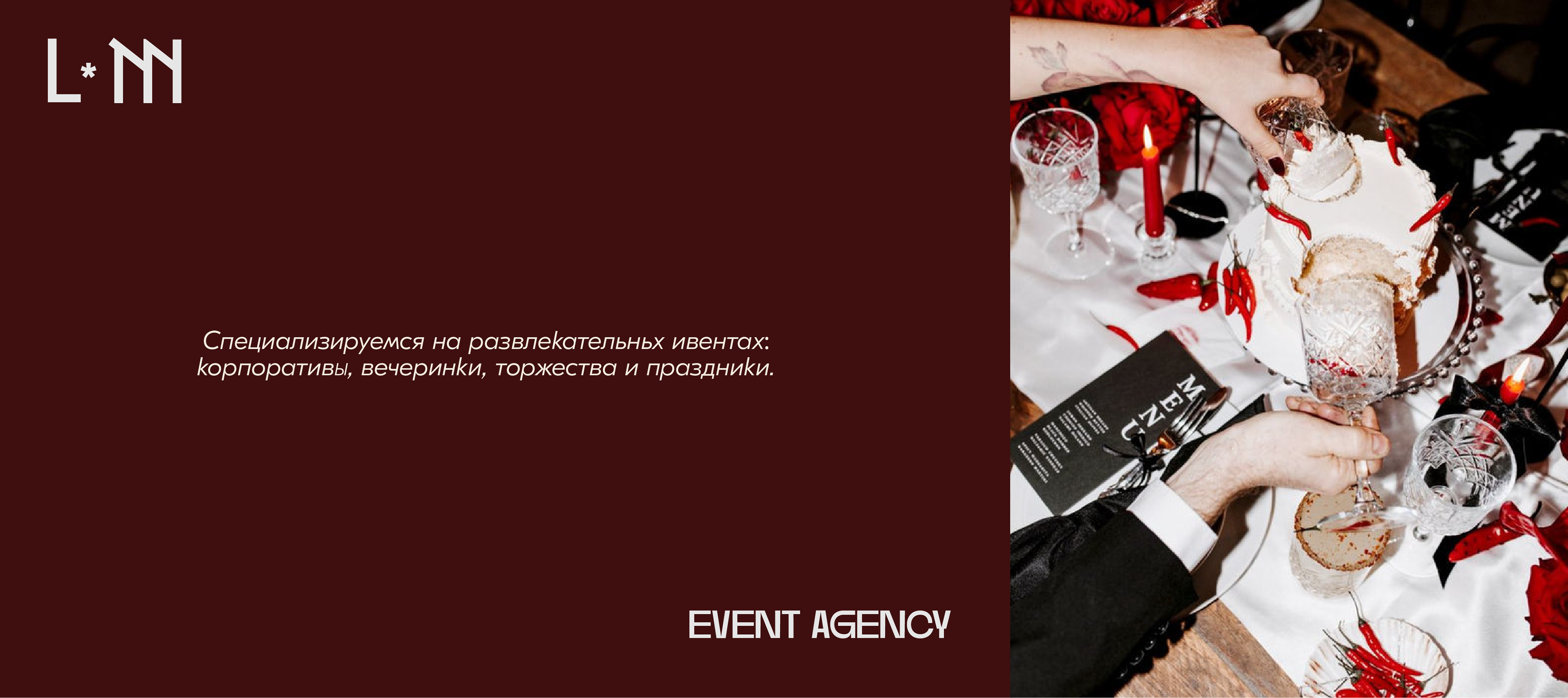
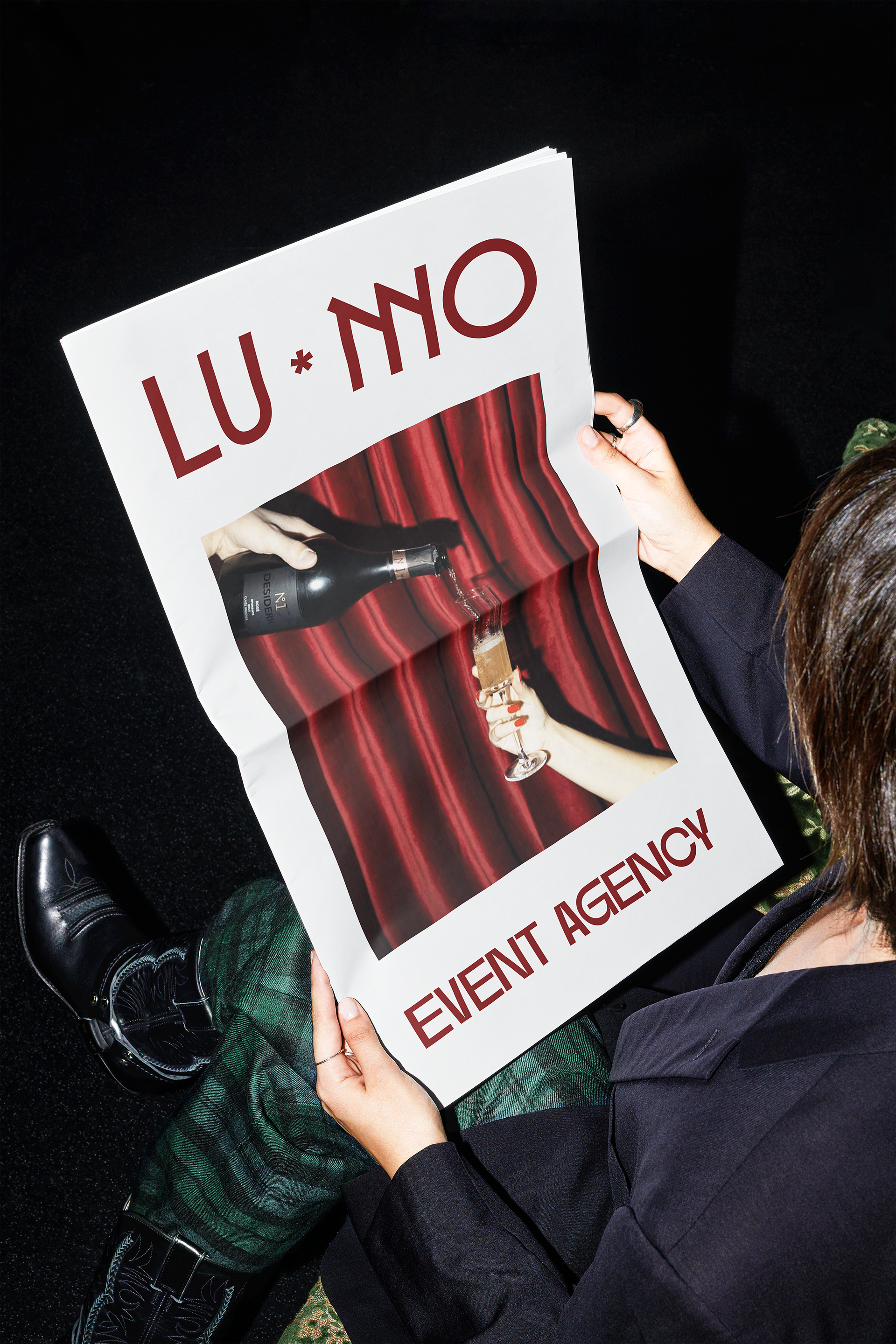
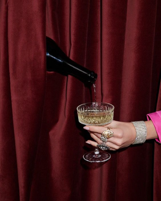
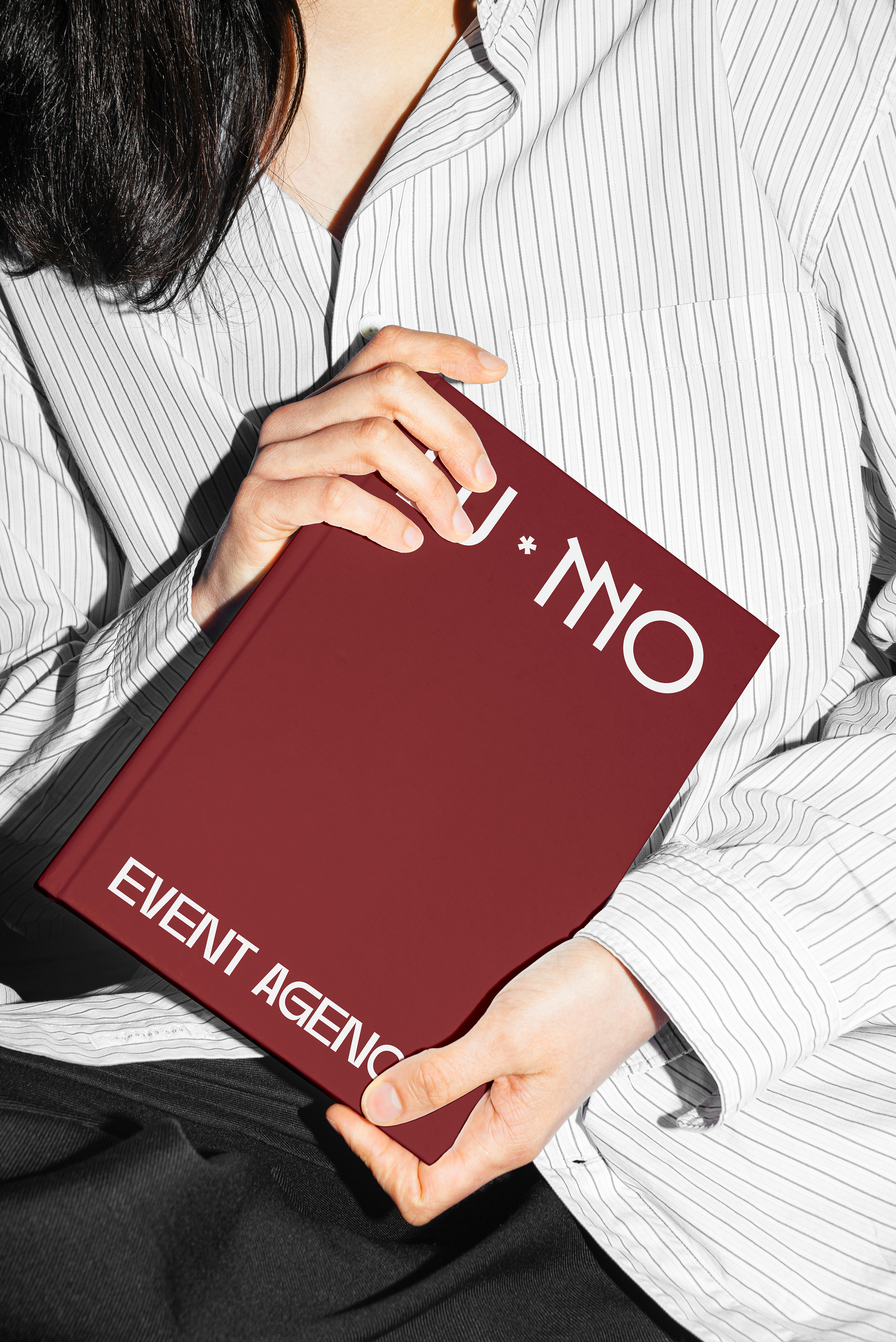
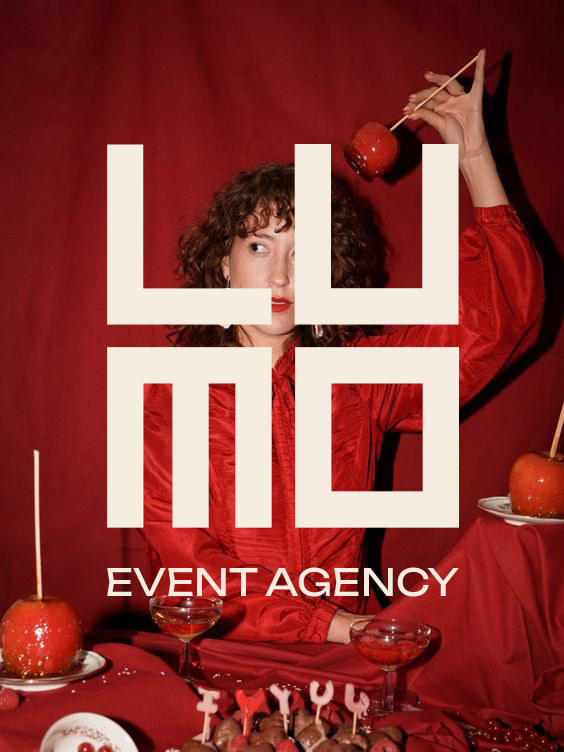
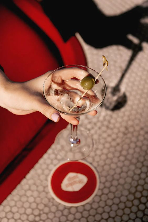
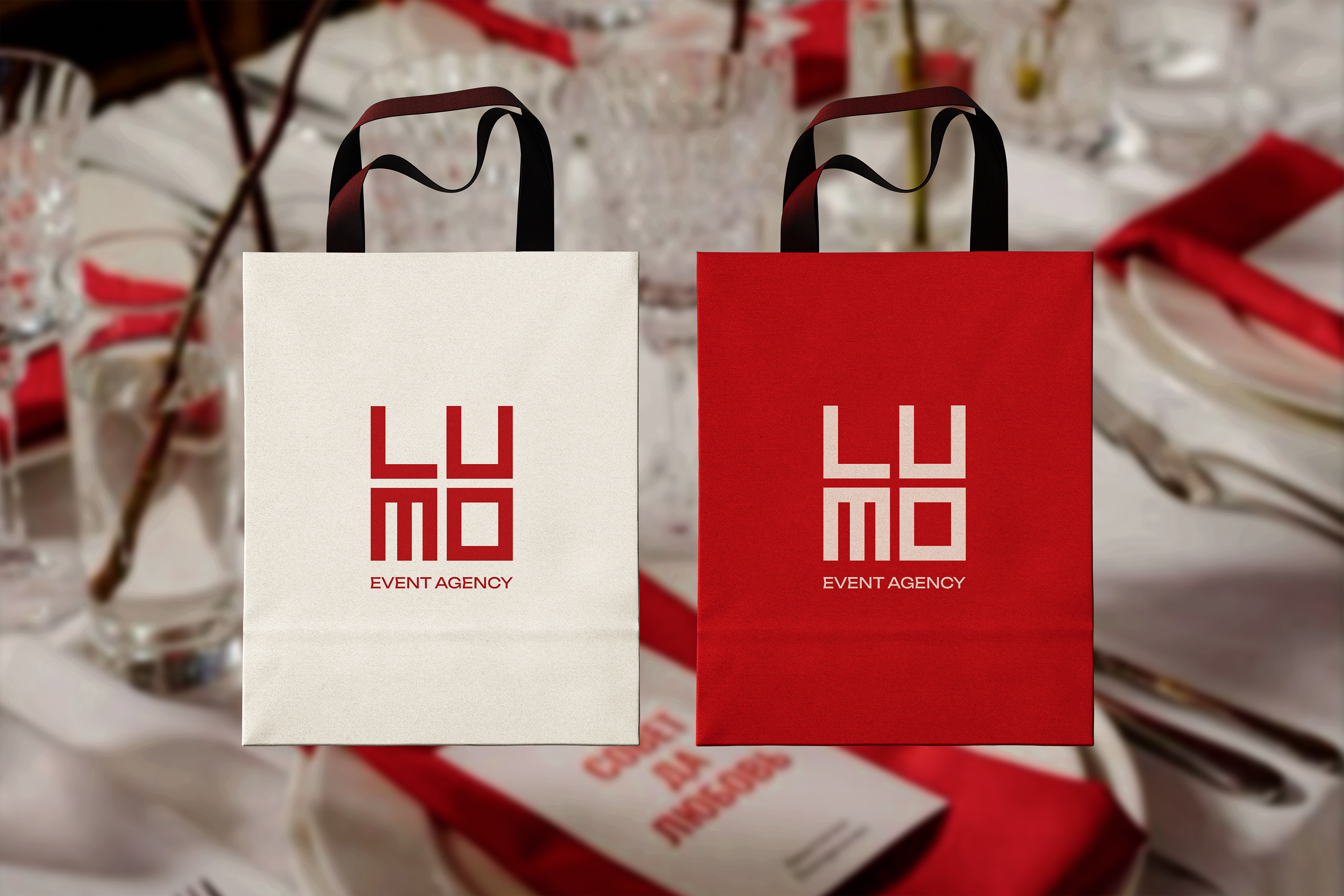
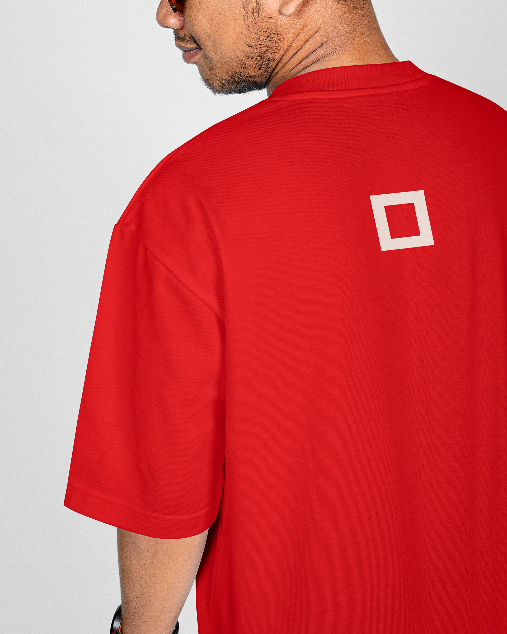
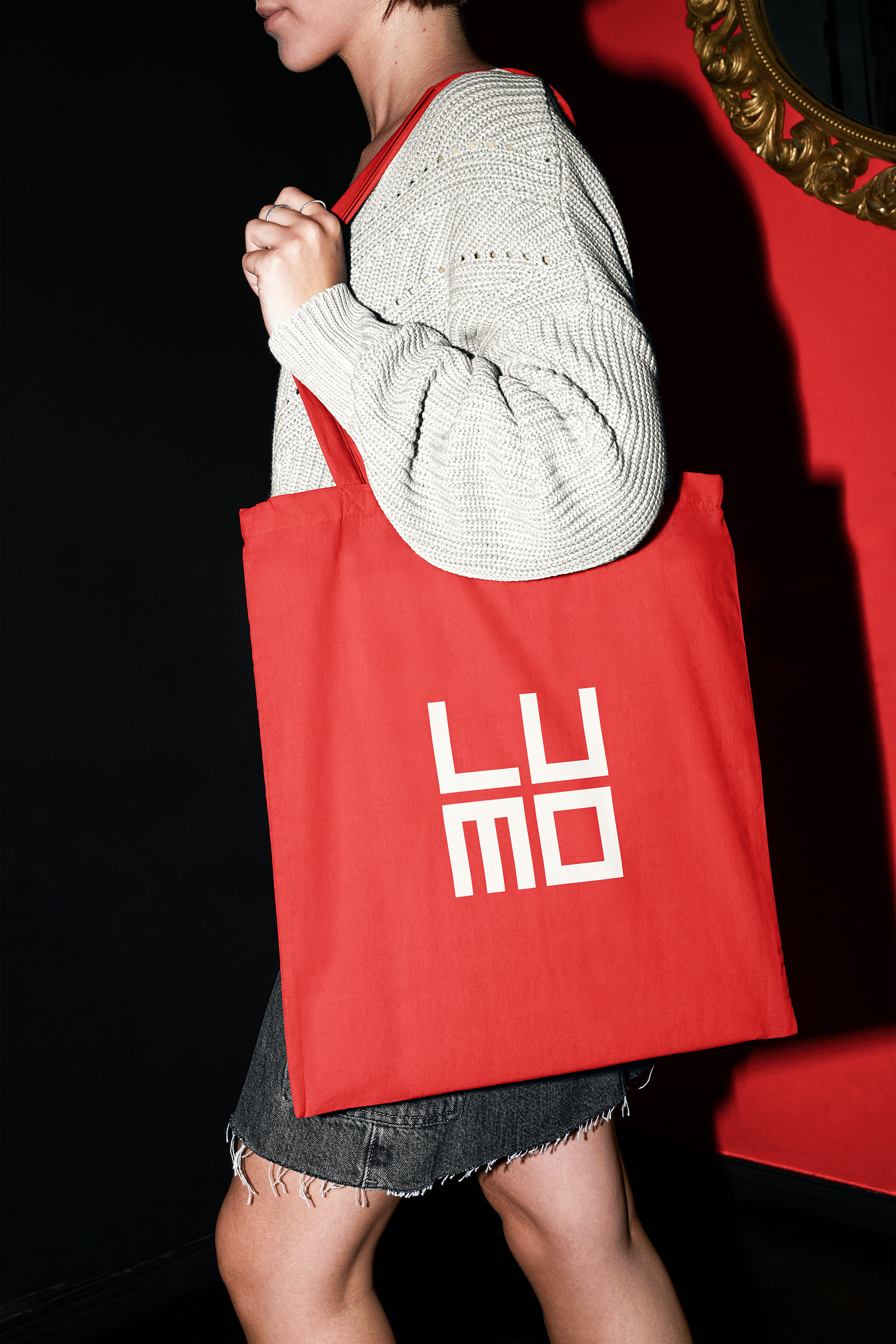
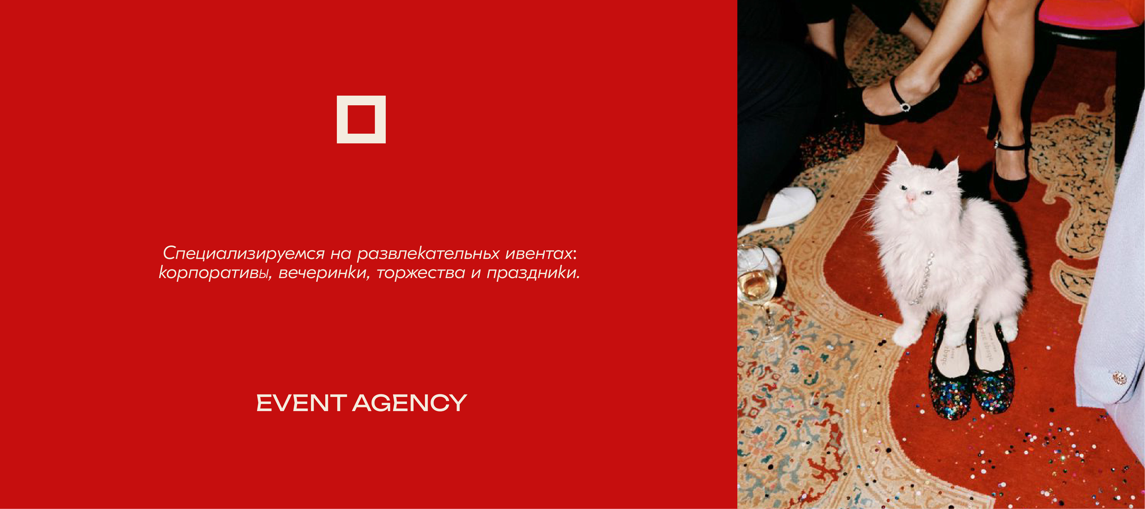
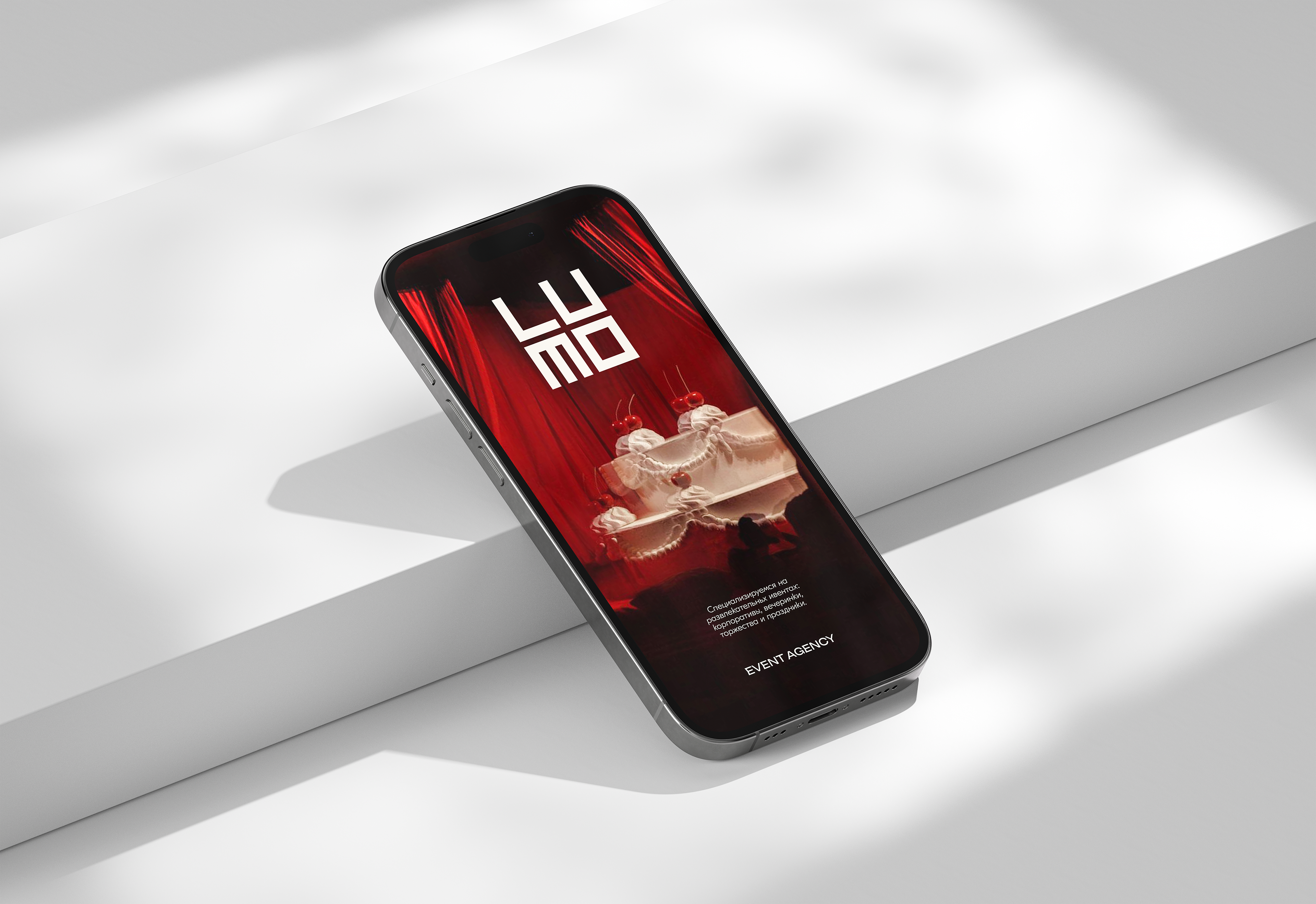
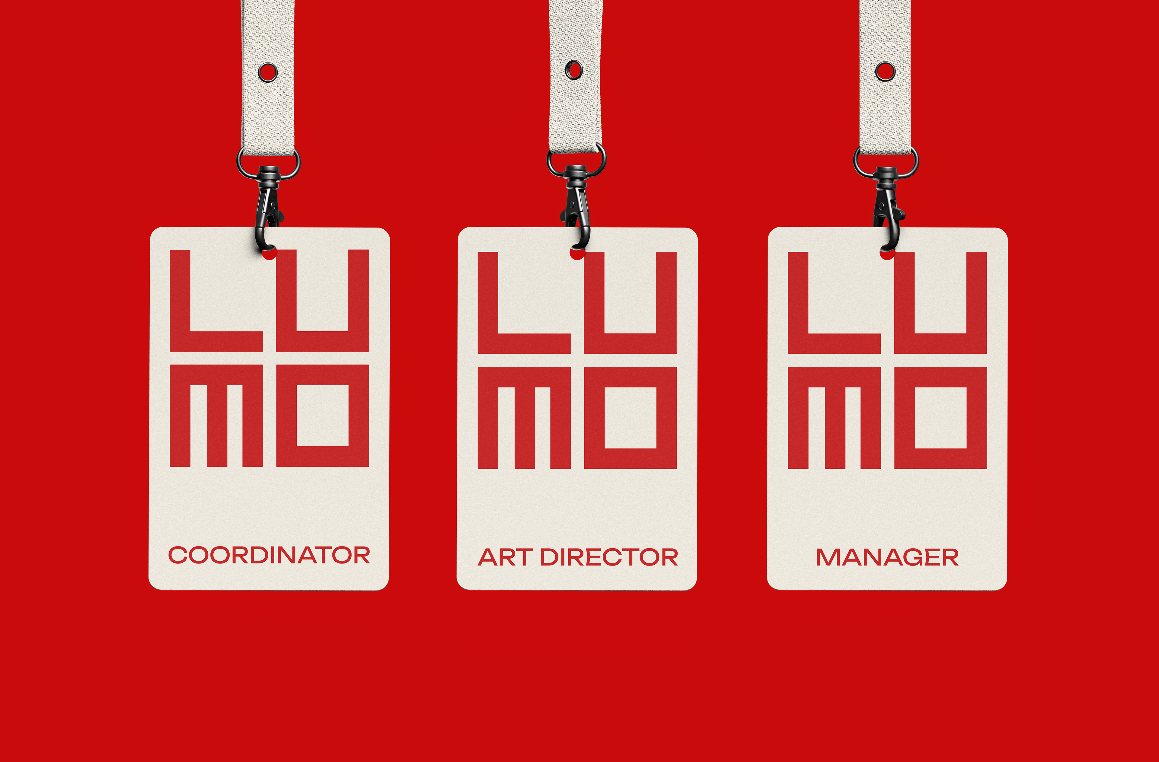
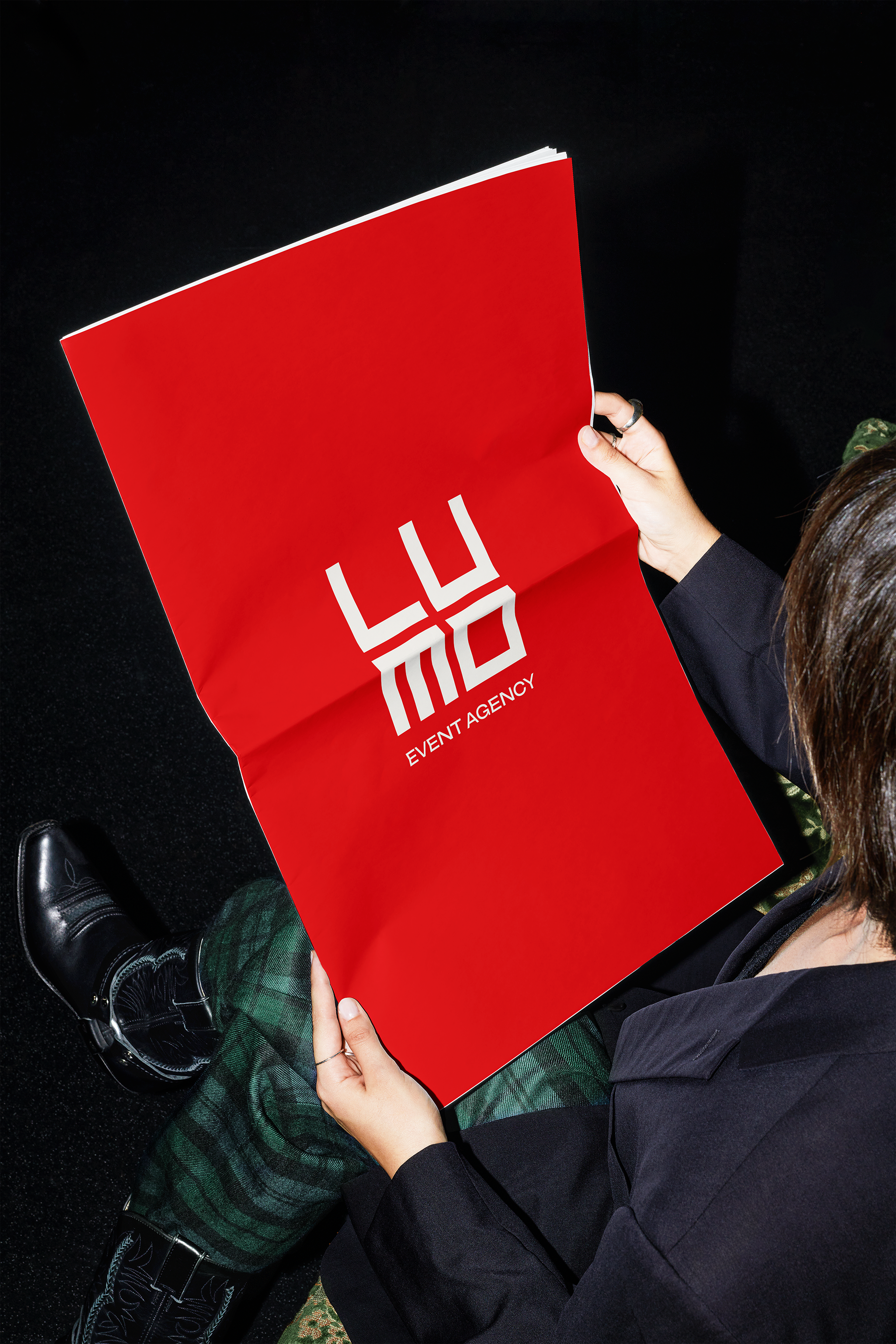
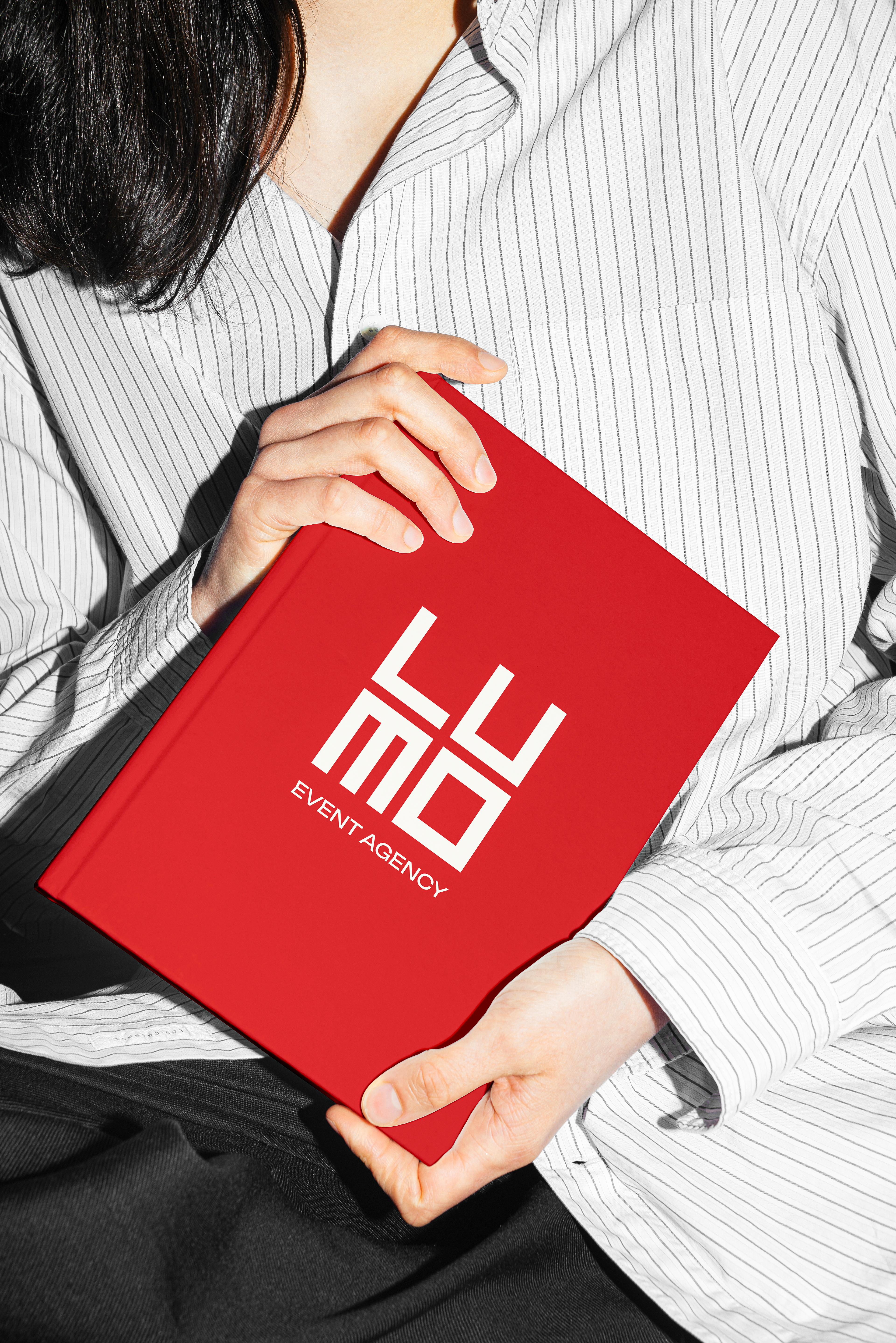
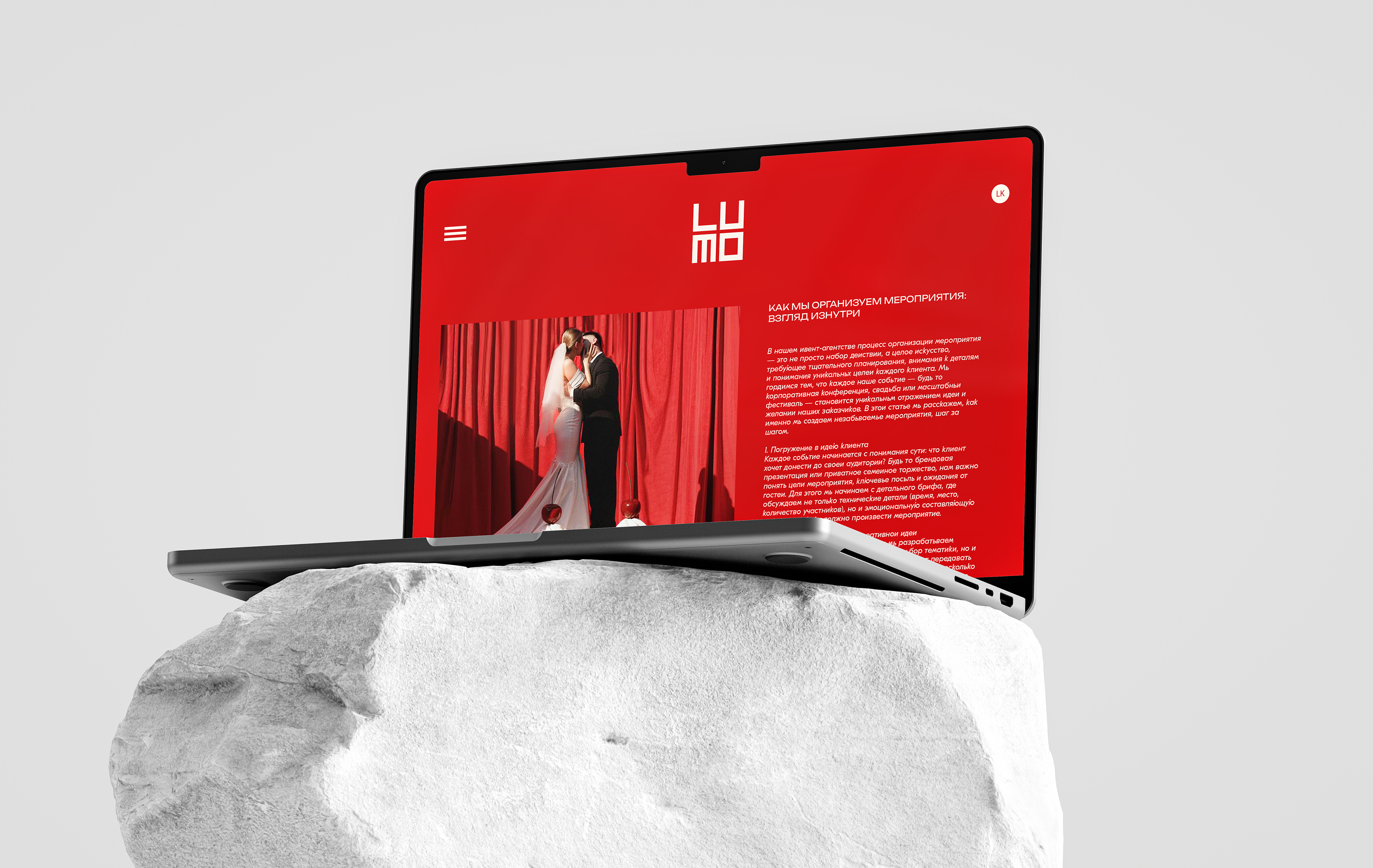
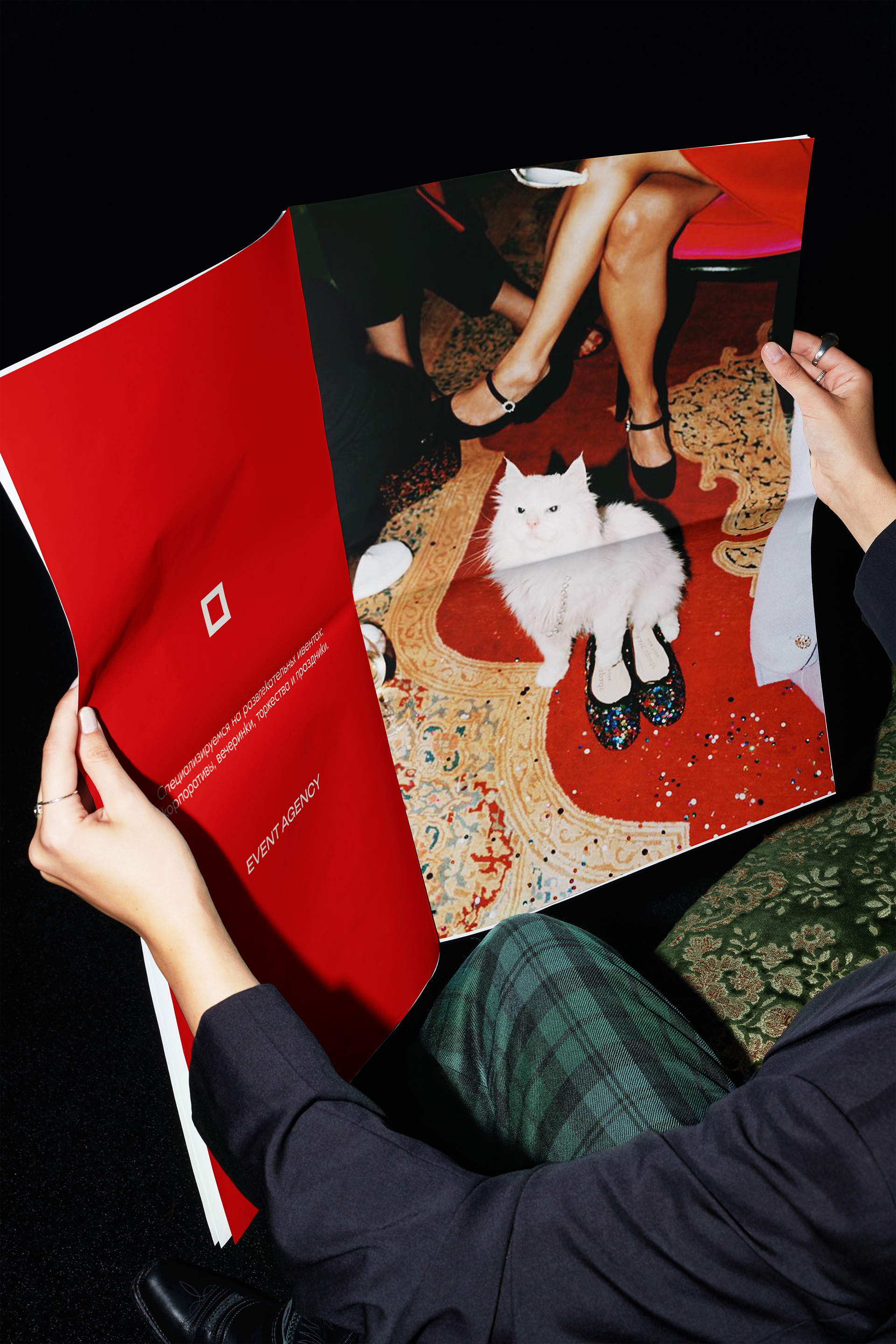
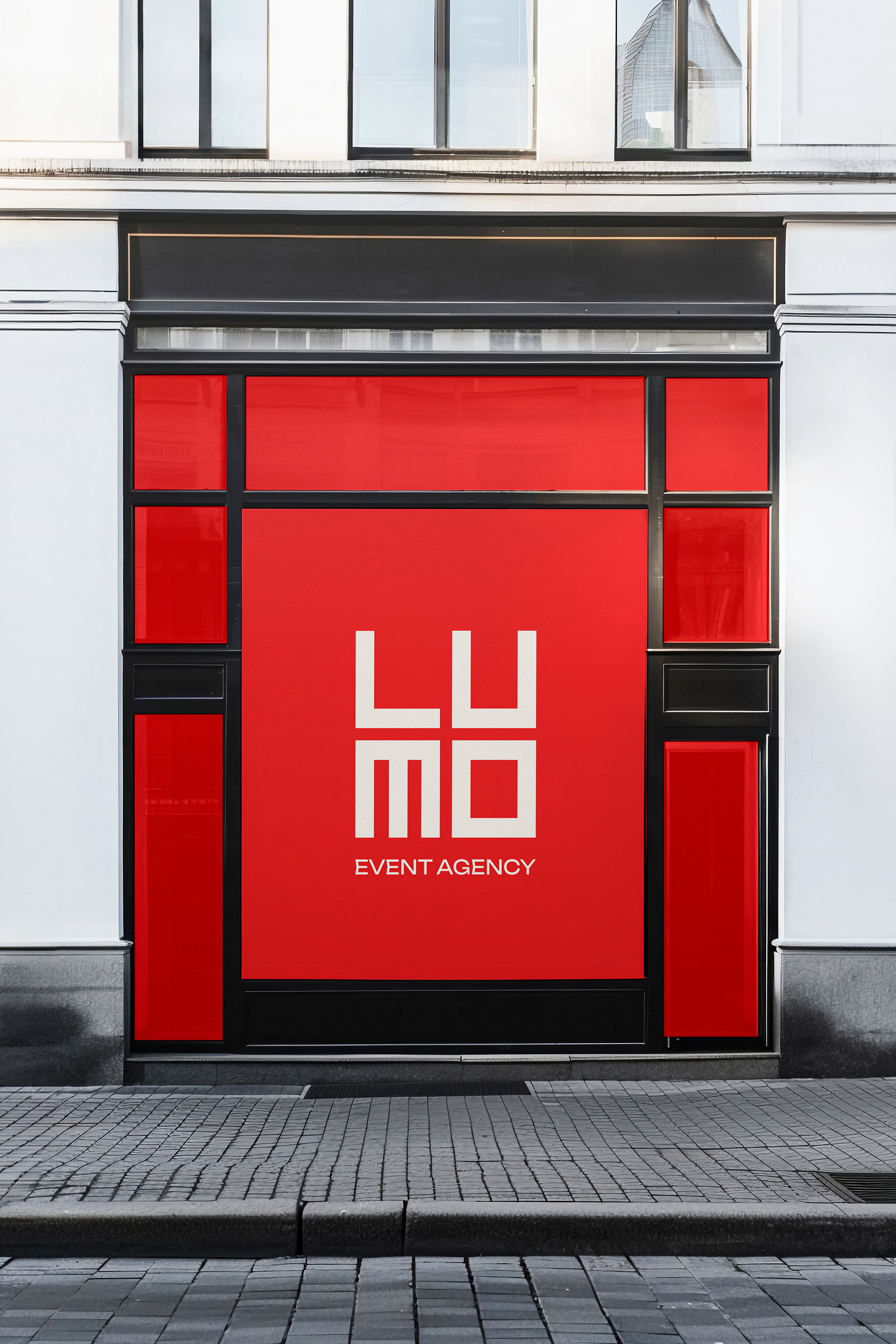
For the second concept, I decided to make it bolder and brighter, using only one accent color—red. Red is a classic, but it also helps convey a sense of freshness, boldness, and confidence for the brand. I complemented the rich red shade with a soft milky color, which I believe helped soften the identity and create a stylish combination.
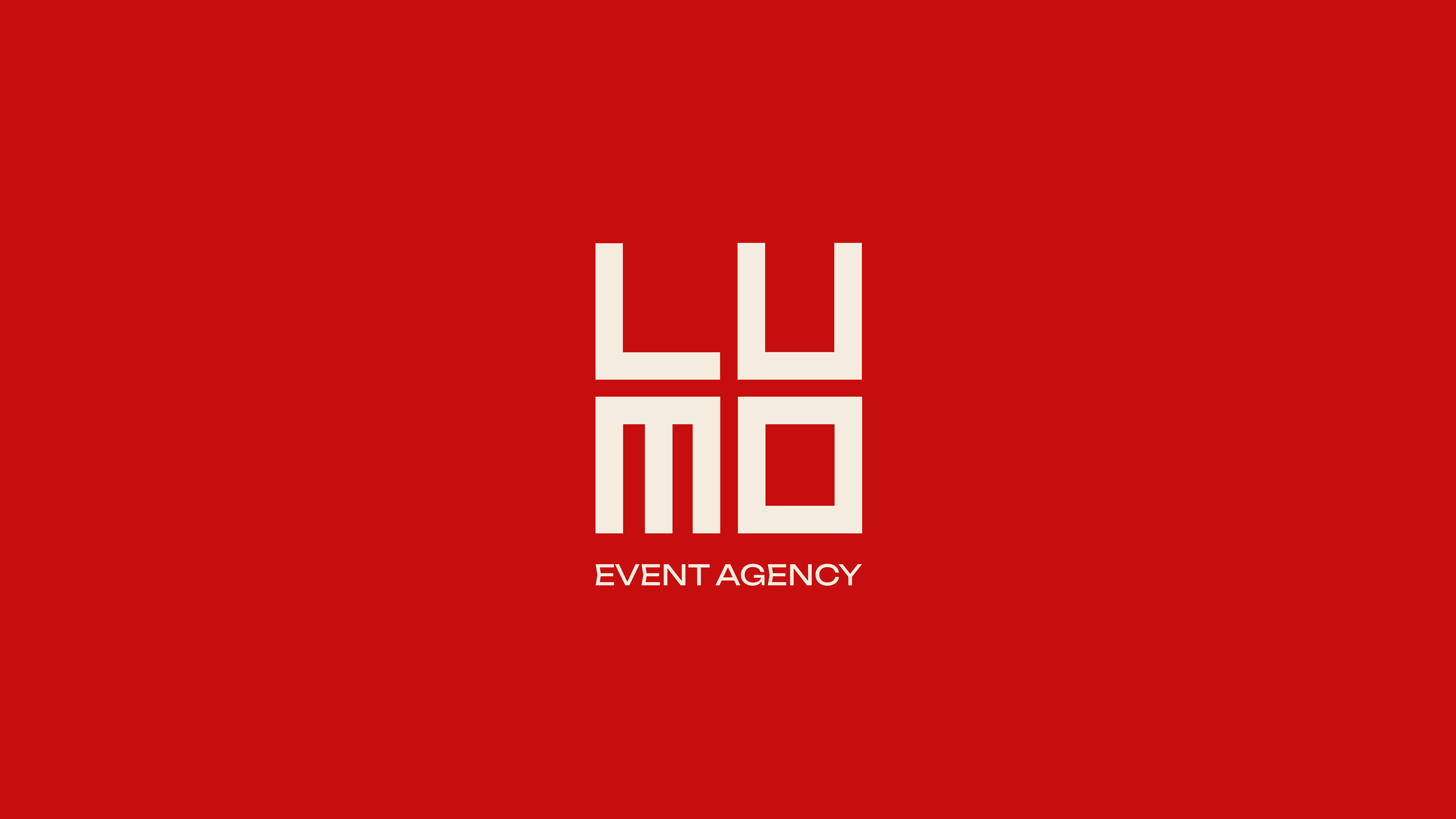
PRIMARY LOGO
This time, I placed the first and second parts of the logo on different lines and decided to unite them into a cohesive square shape. To achieve this, I created typography with very angular and geometric lettering, which helped balance the elements and make the logo look like a unified design.
SUBMARK
COLOR PALETTE
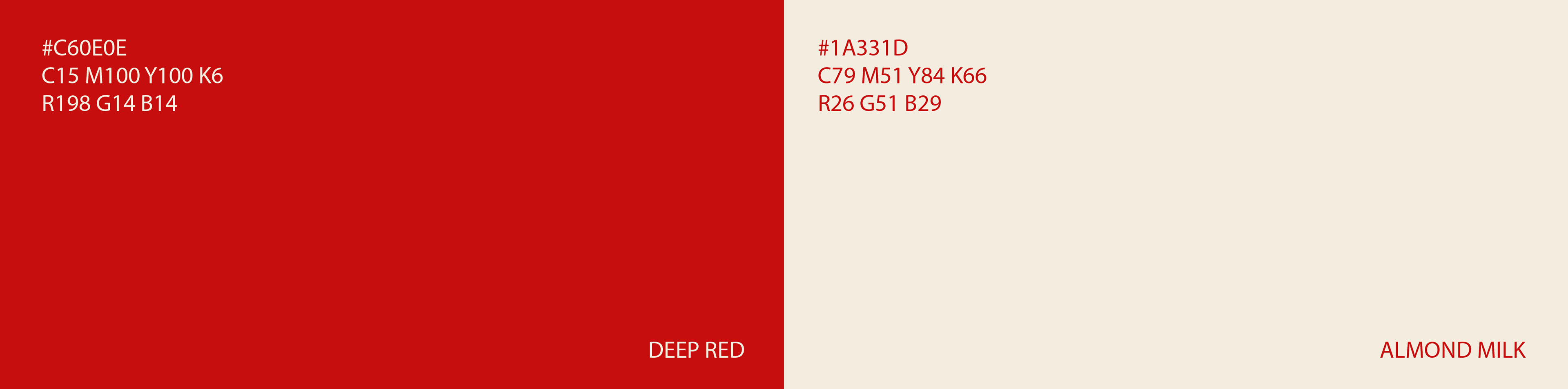
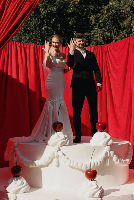
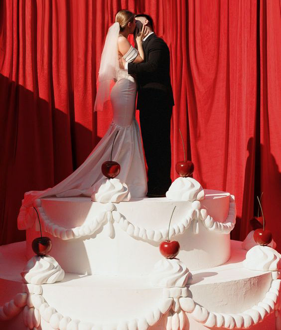
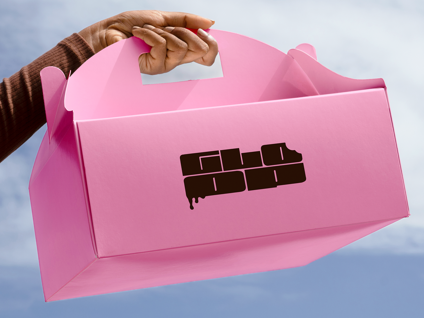
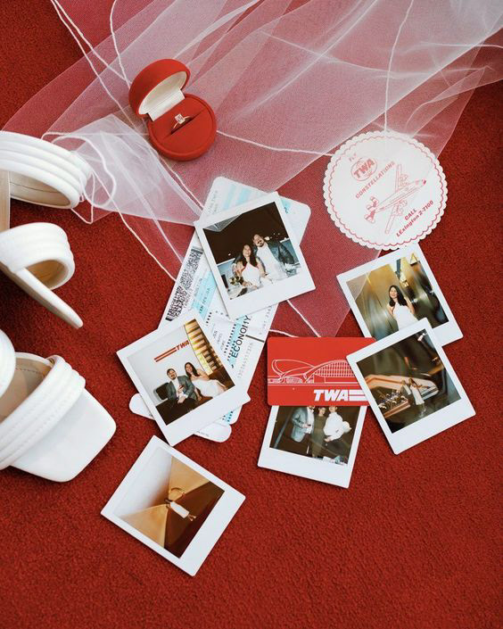
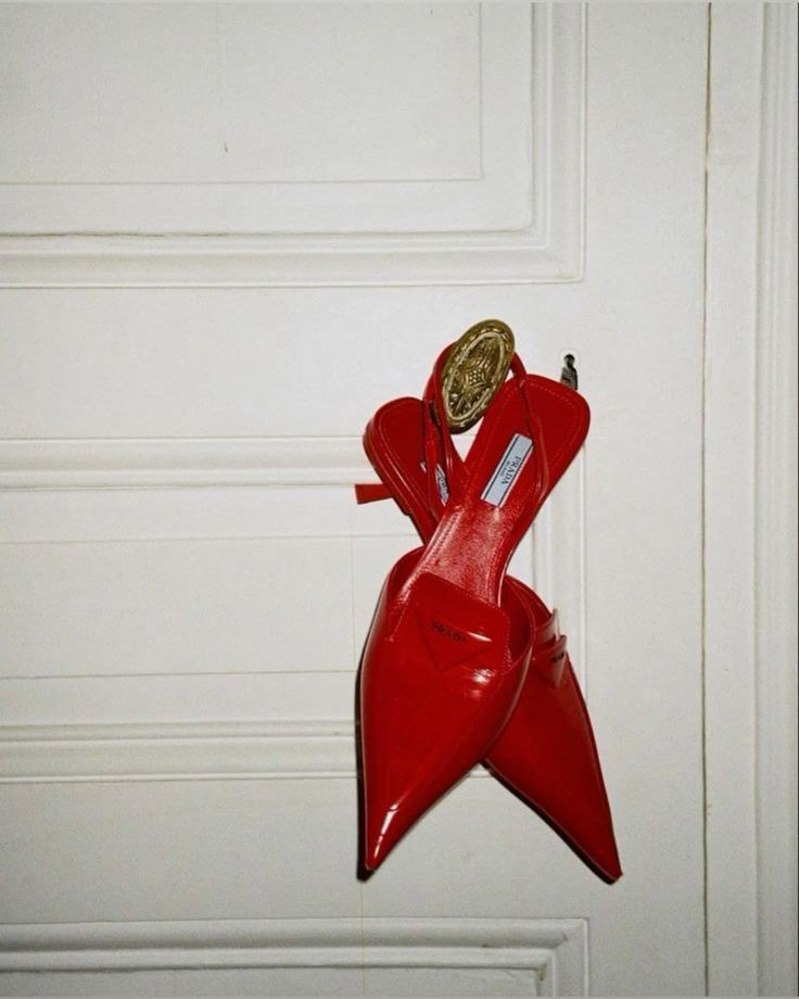
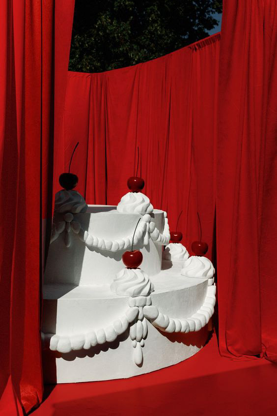
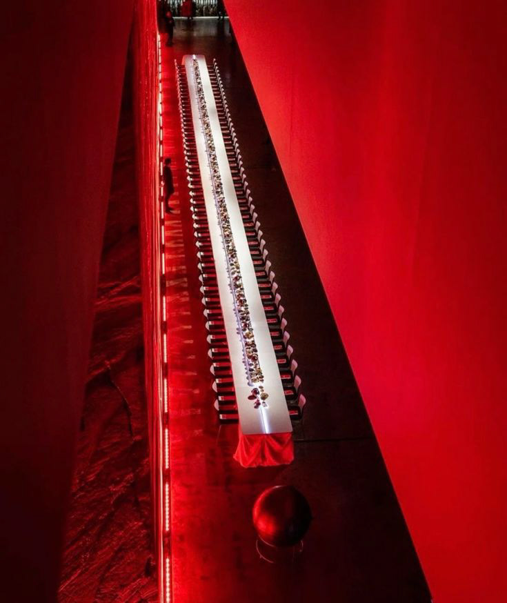
IDENTITY IN ACTION
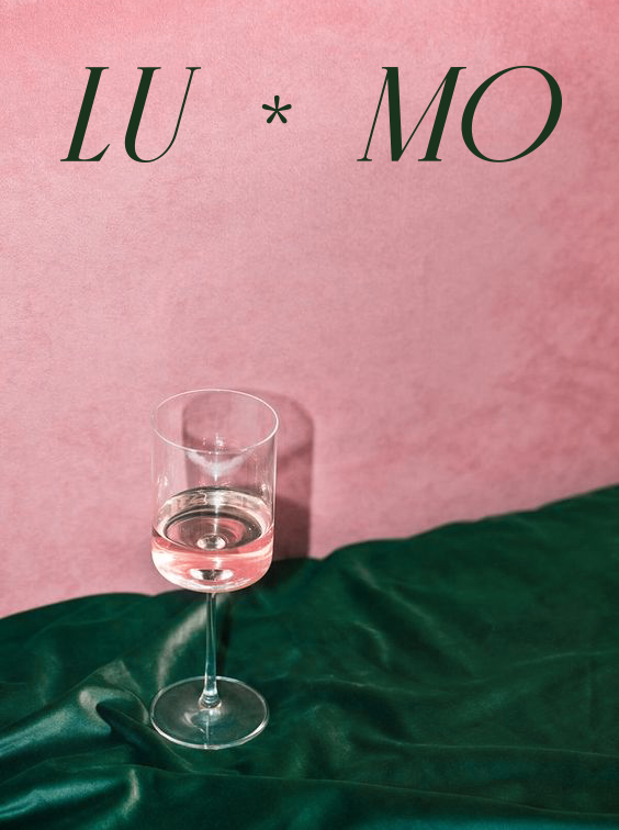
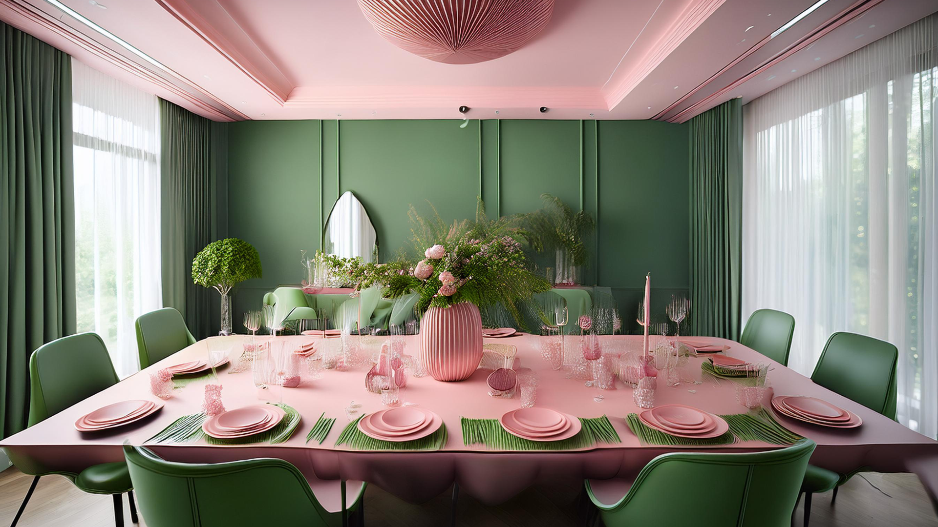
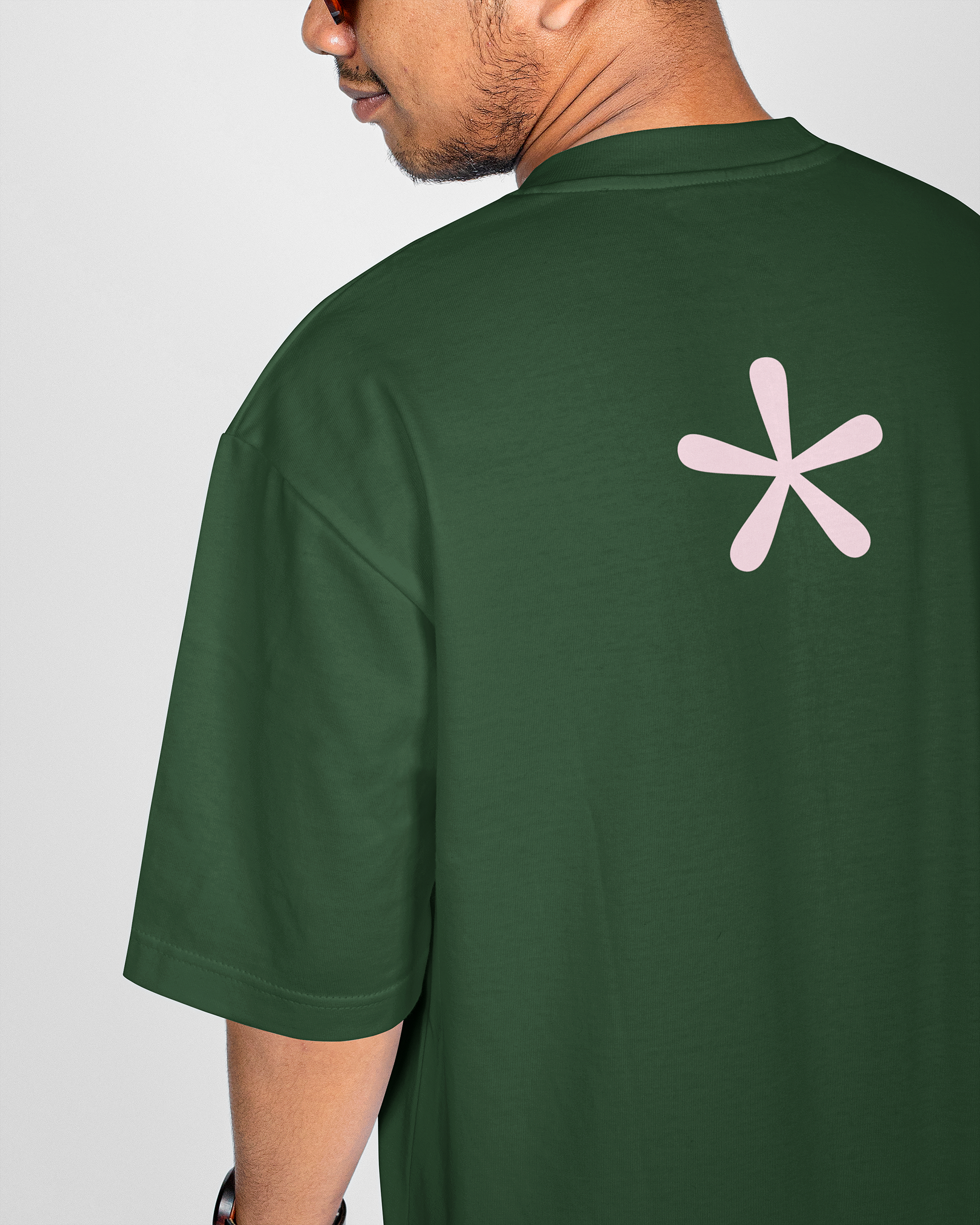
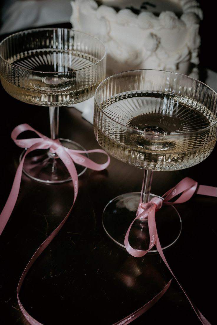
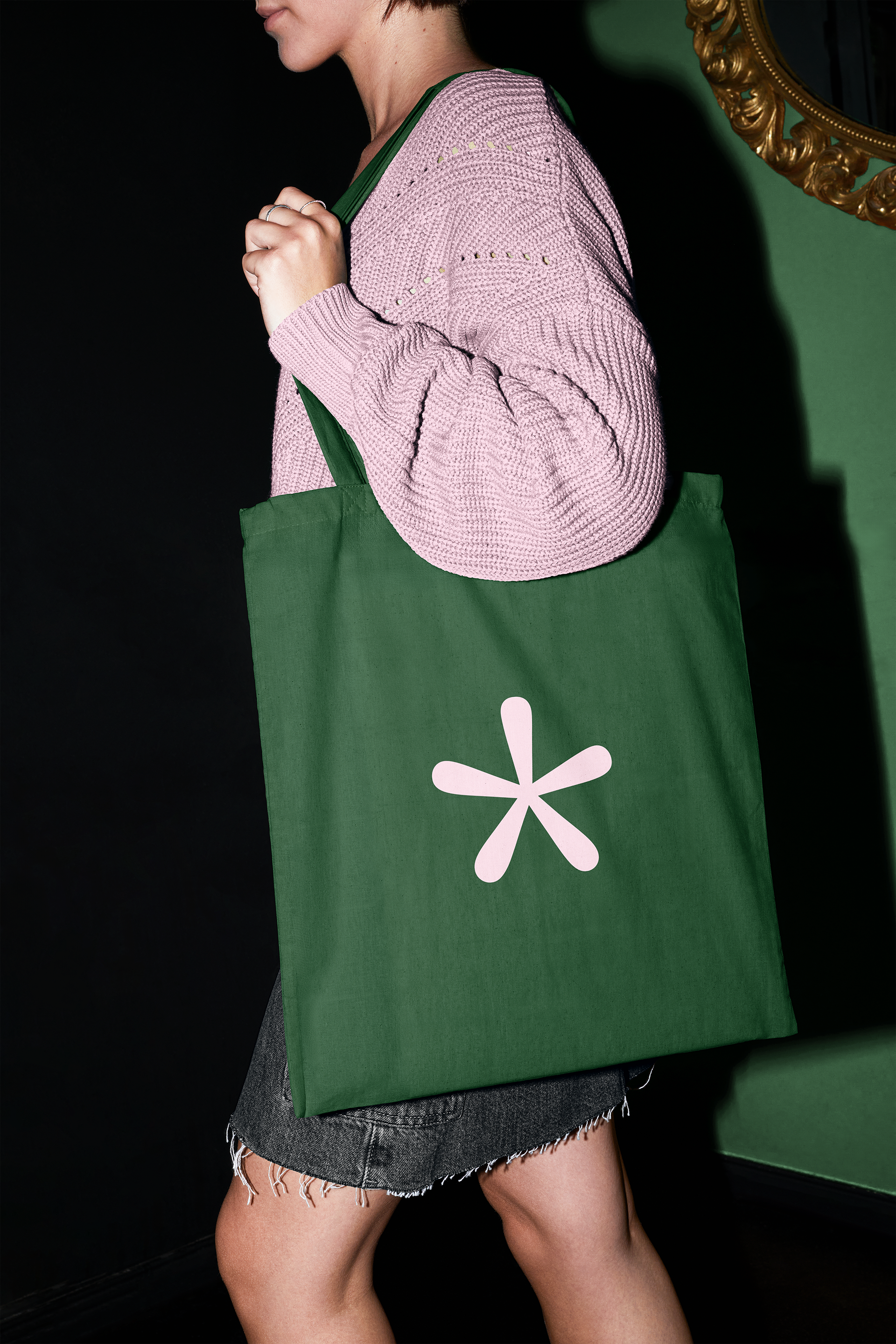
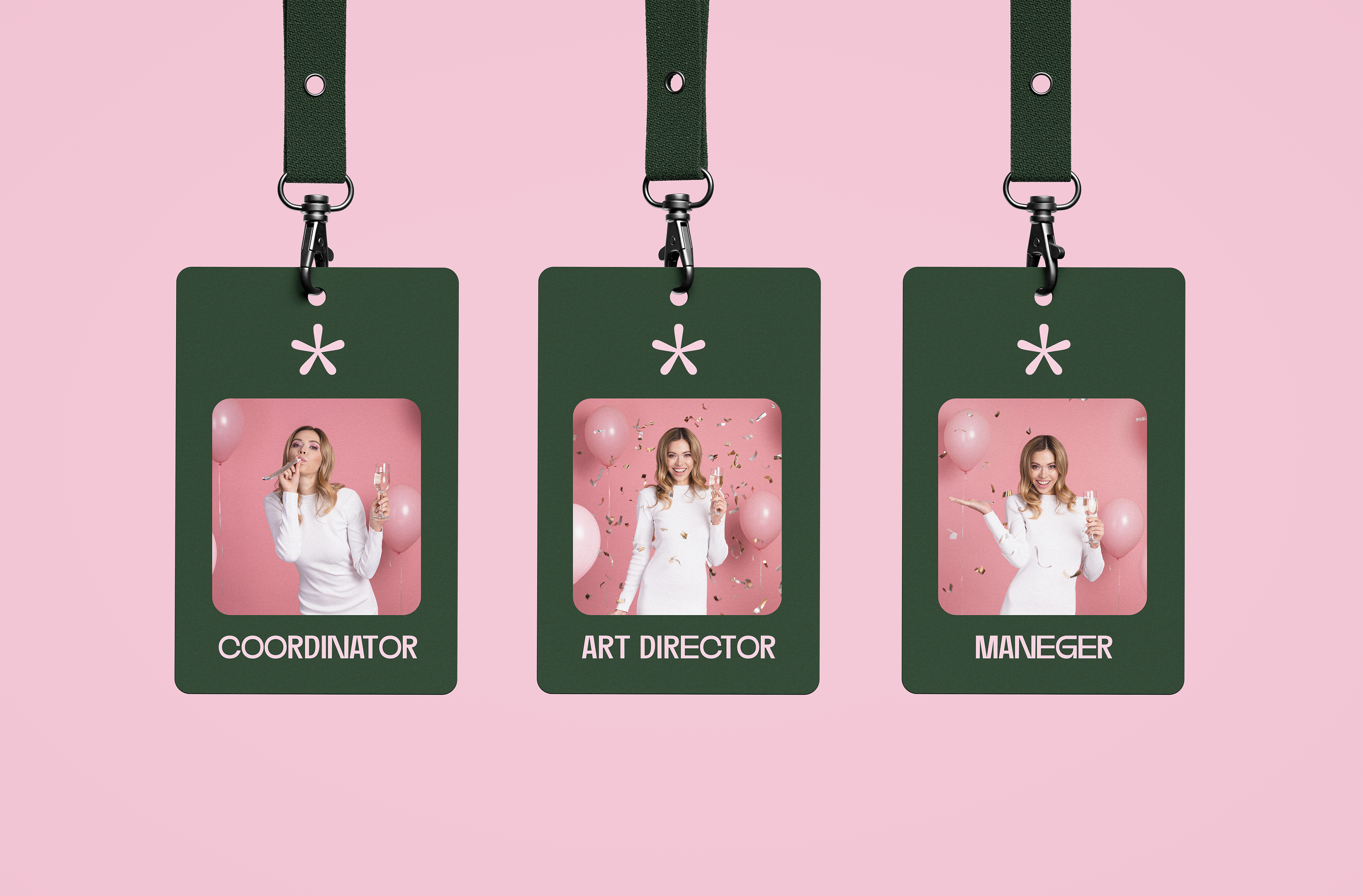
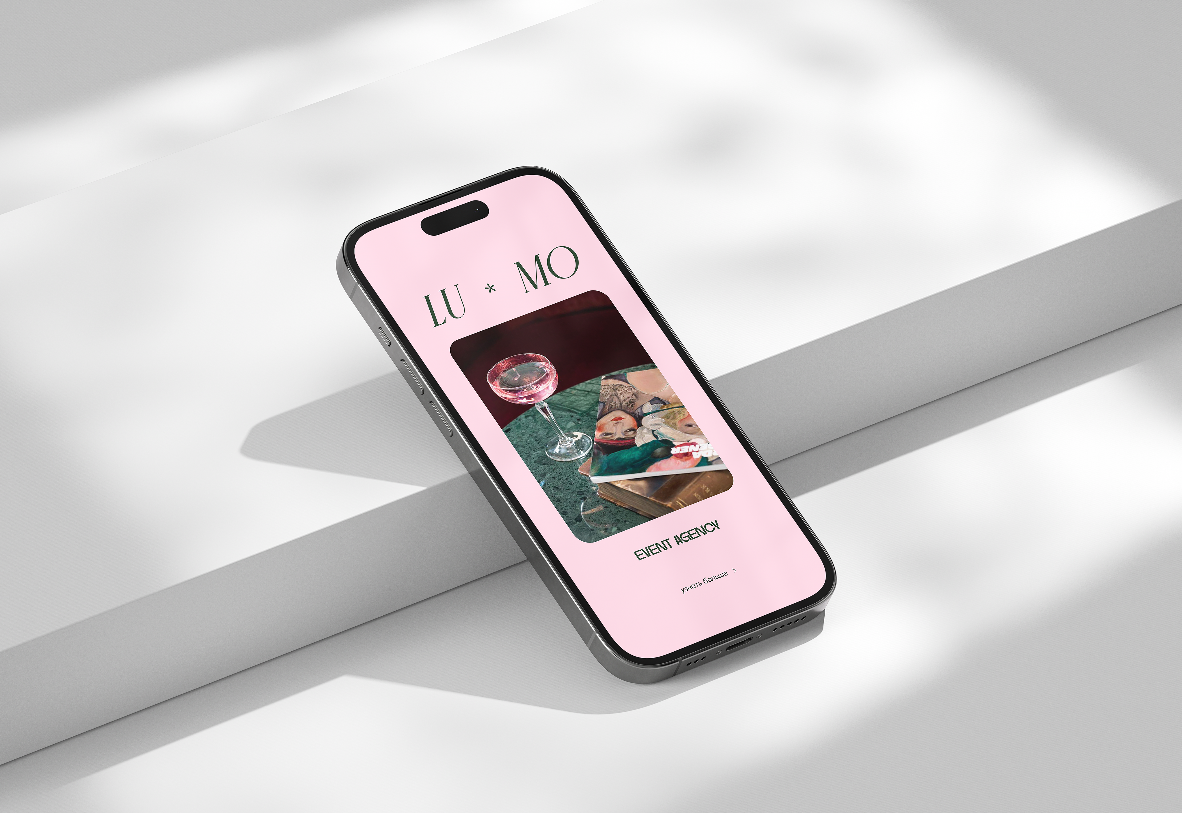
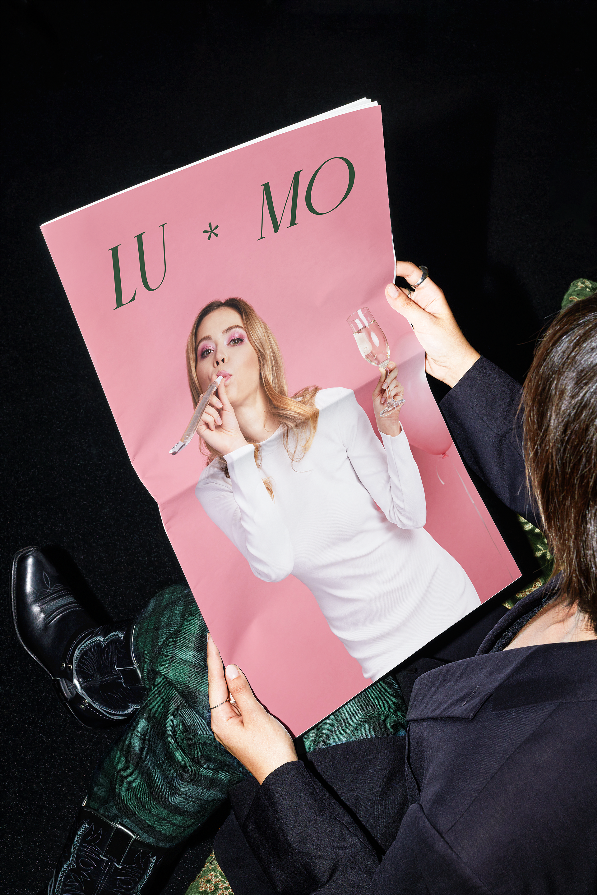
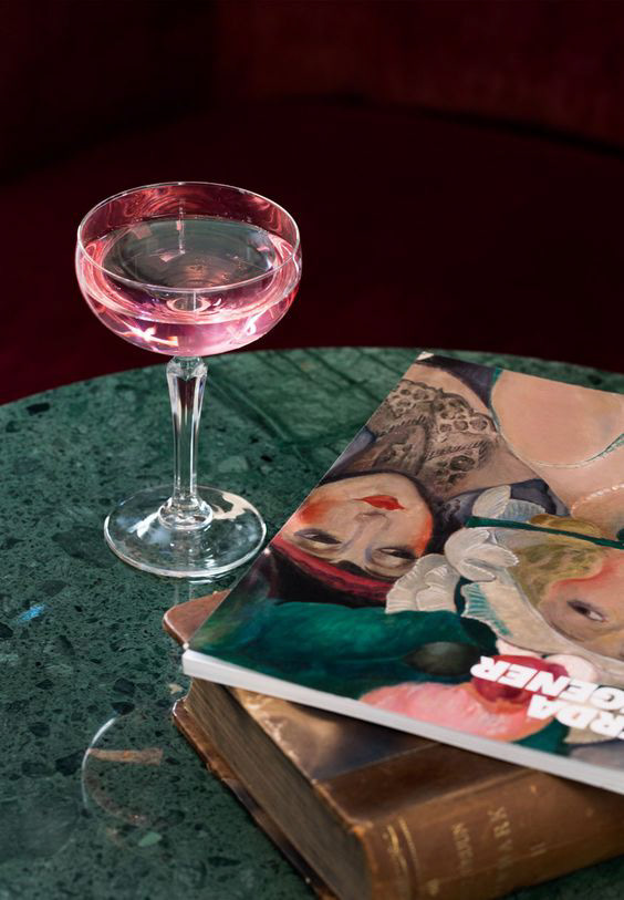
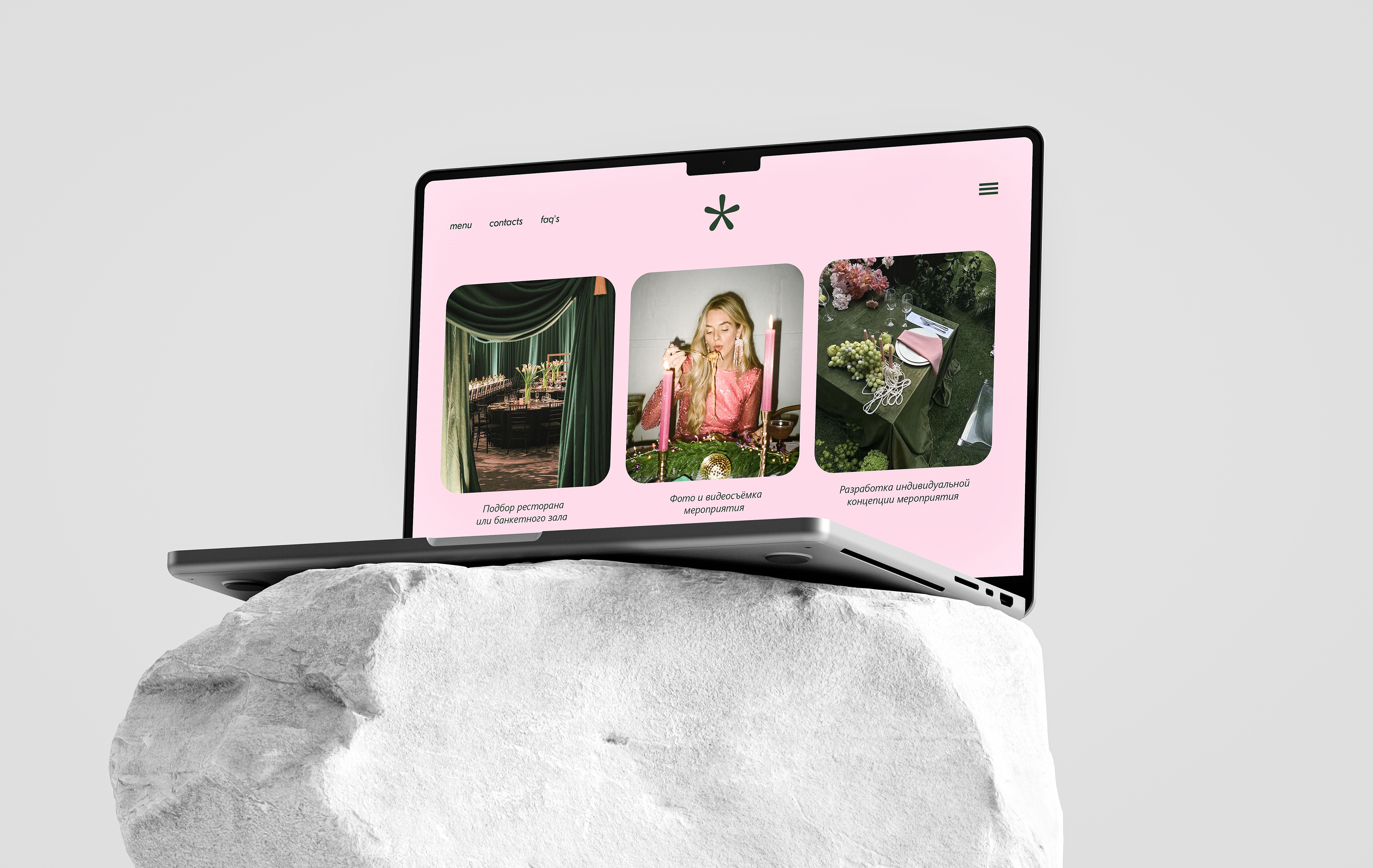
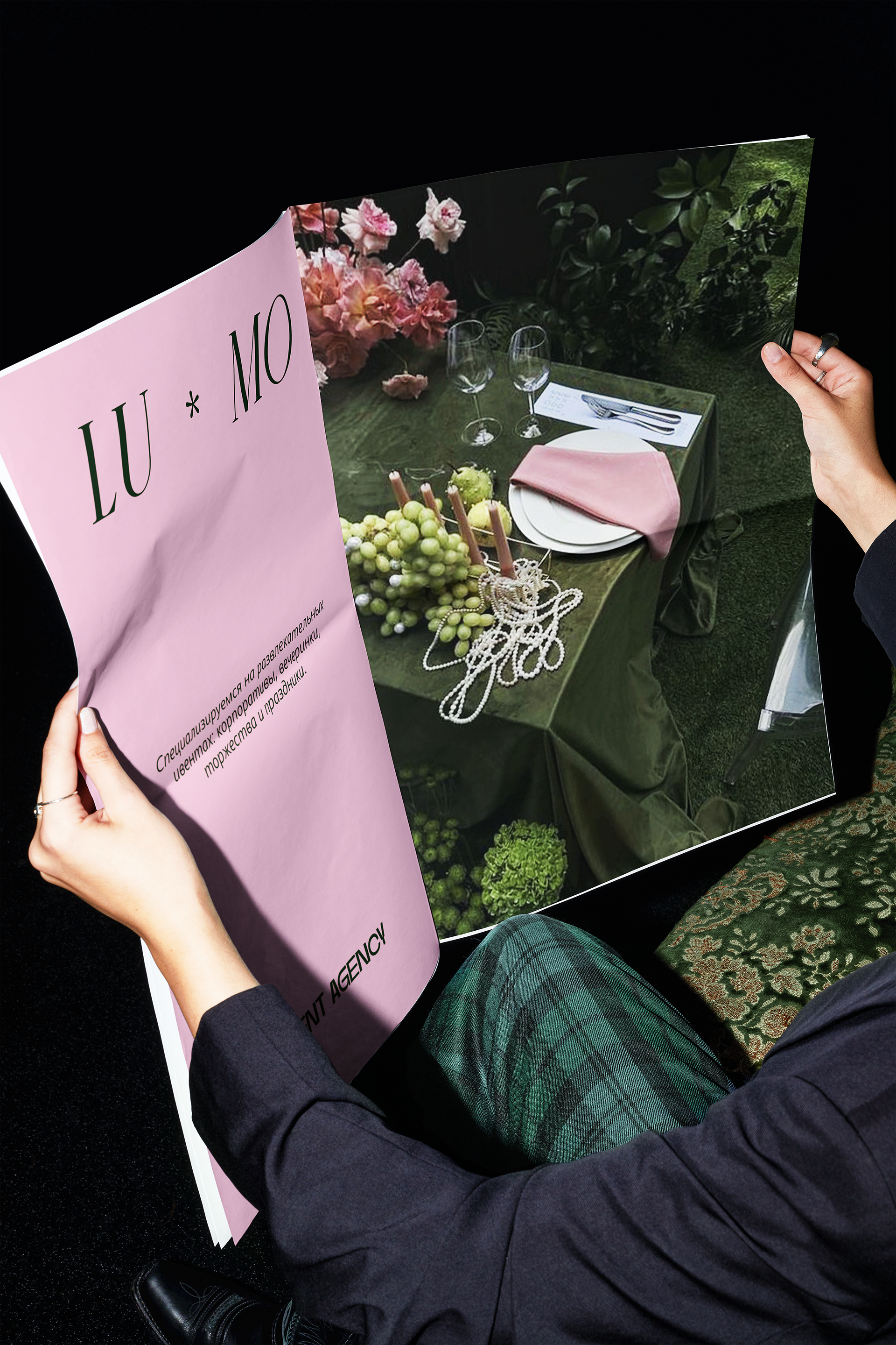
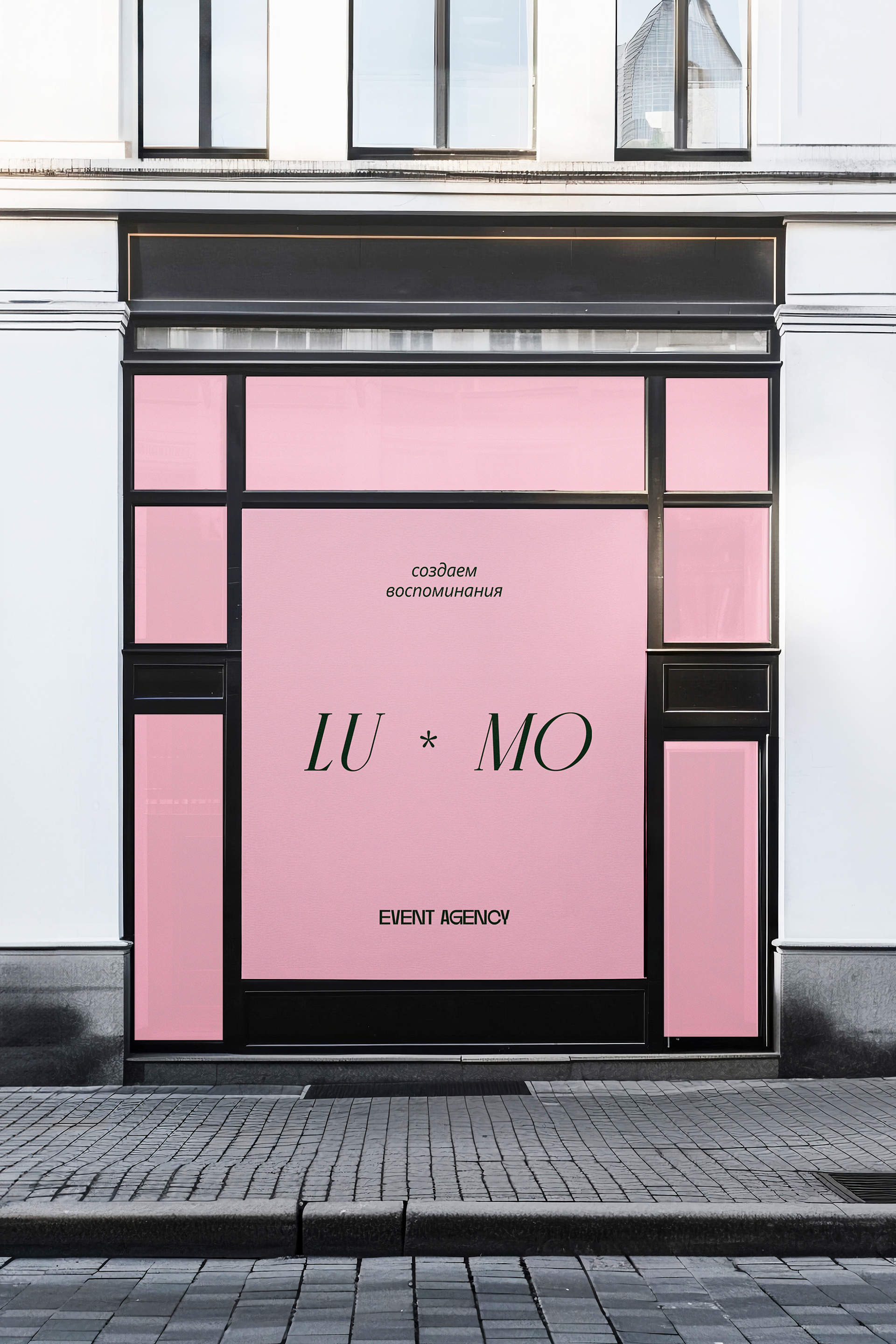
CONCEPT NO3
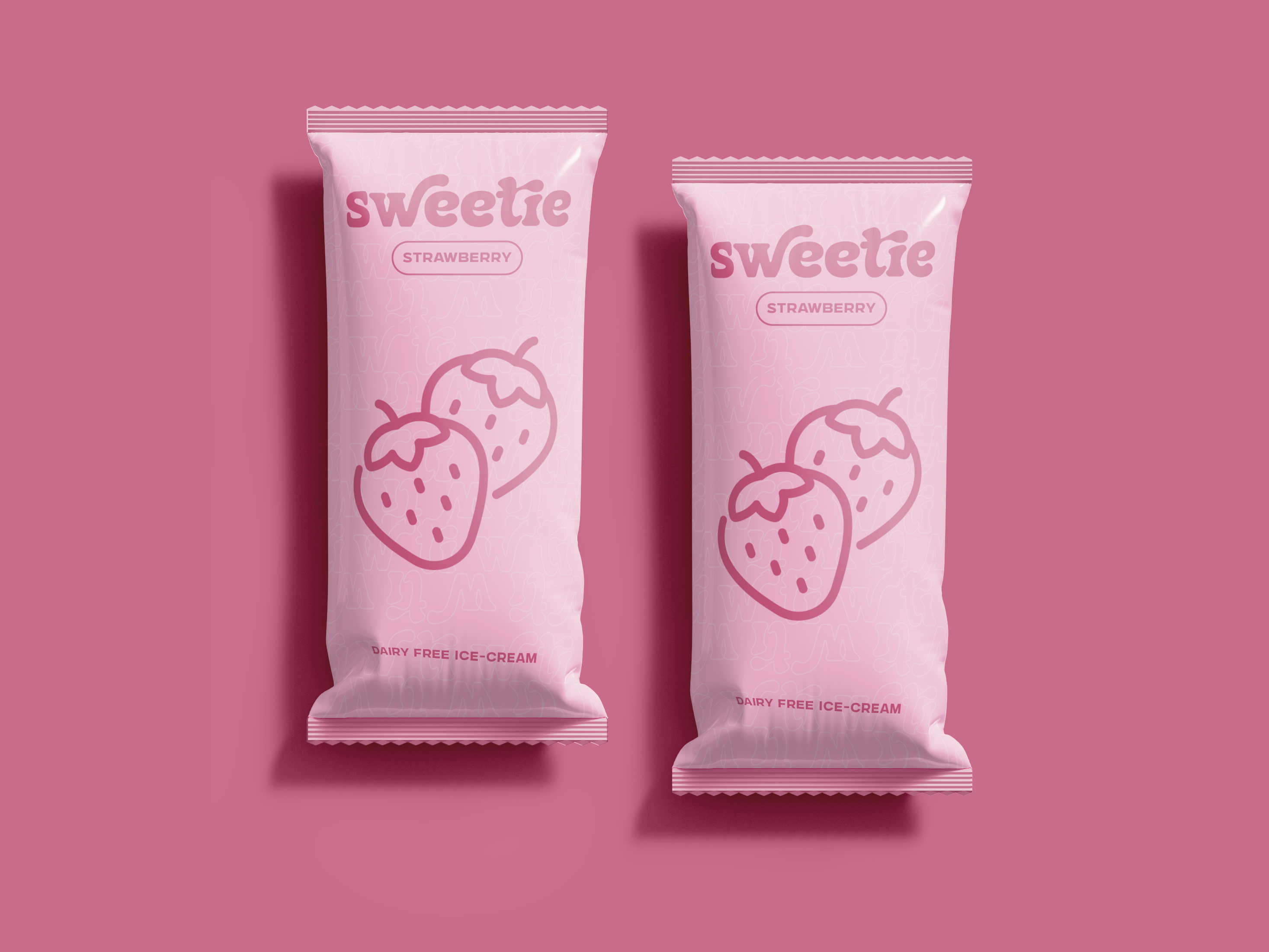
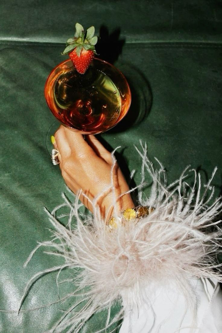
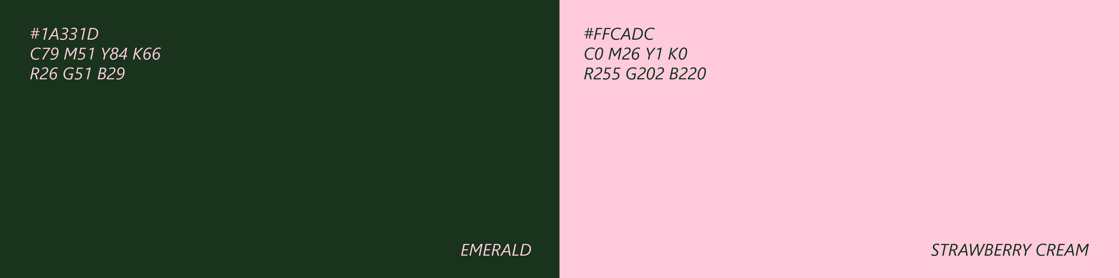
For the third branding concept for LU MO, I decided to go with a softer and more romantic style to convey the sense of magic and nostalgia that the agency creates for its clients. I kept the emerald color from the first concept and added a delicate pink shade to complement it.
PRIMARY LOGO
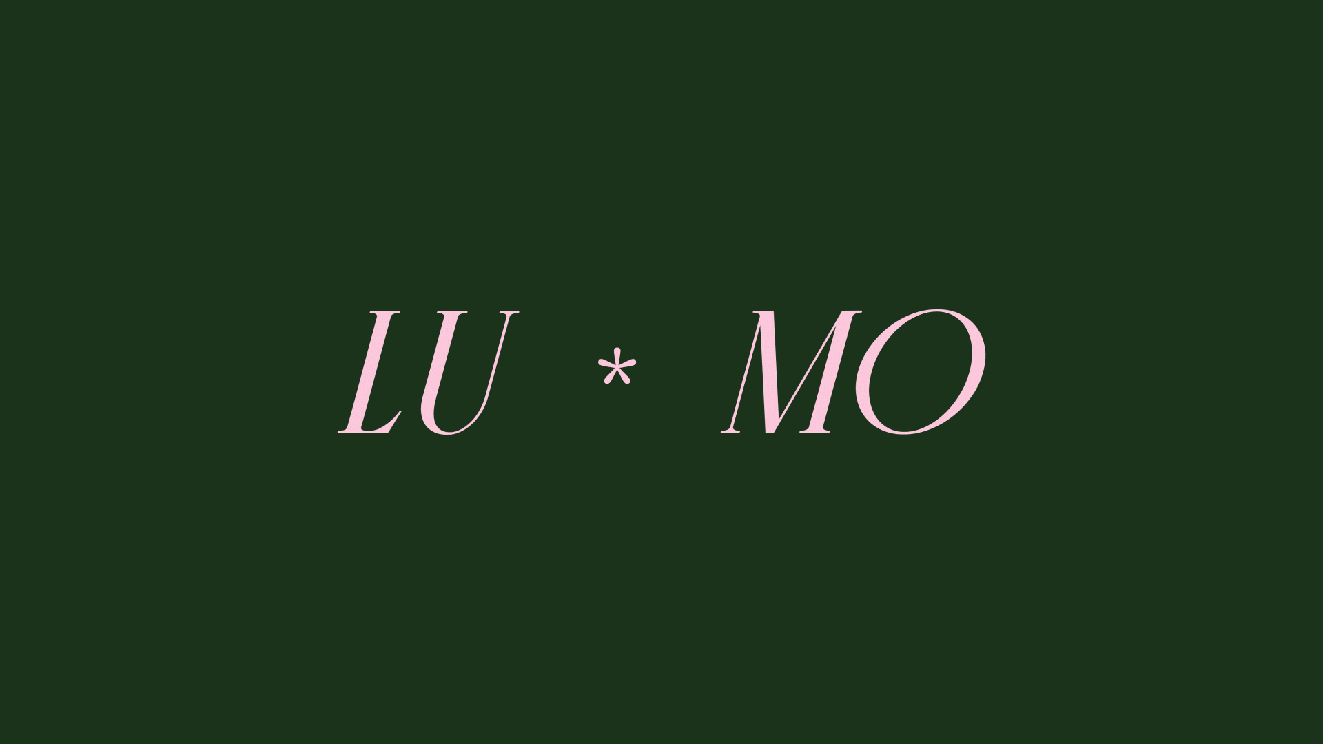
Here, I decided to use the technique of splitting the logo into two parts again, but this time I chose softer and lighter elements. For the typography, I used an italic serif font, which reflects romance and elegance, while the dividing element resembles a flower, fitting well into the overall concept.
SUBMARK

COLOR PALETTE
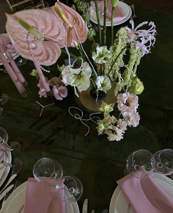
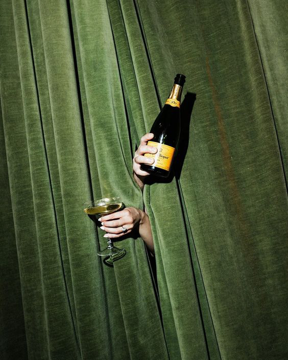
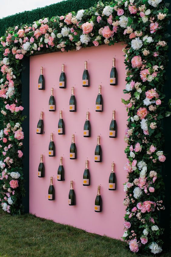
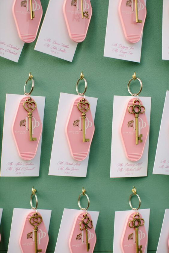
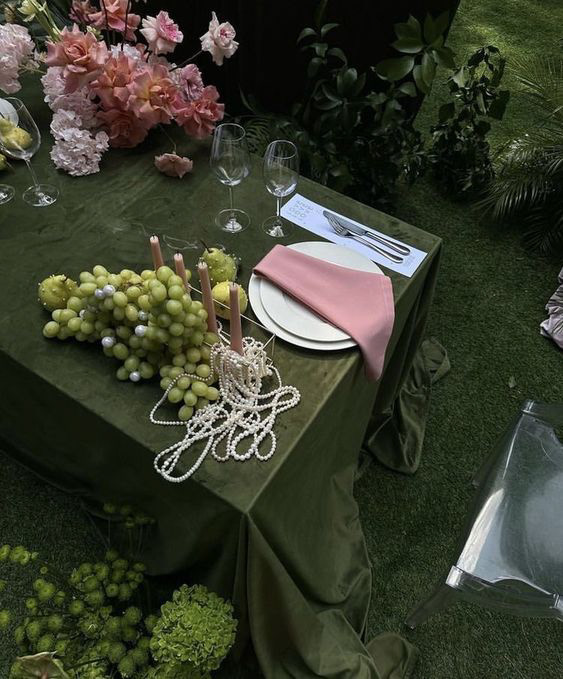
IDENTITY IN ACTION

THANK YOU!